← Irene Porro / Selected workLet’s talk ↗
CertaAdminB2B SaaS / Food & ingredient certification

Product design · Workflow design · UI system · Brand identity

A certification platform
for agencies and the companies they certify.

Certification agencies were running applications, inspections and renewals across email, PDFs and spreadsheets. I designed Certa Admin end to end: the product model, every role’s workflow, the interface and the brand.

Explore the design decisions ↓
Problem

Certification agencies ran applications, inspections and renewals across email, PDFs and spreadsheets.

My role

Sole Product Designer: product model, four role workflows, 58 screens, UI system and brand identity.

Result

A complete, ready-to-build product design, plus a client portal and supervisor mobile view added in this redesign.
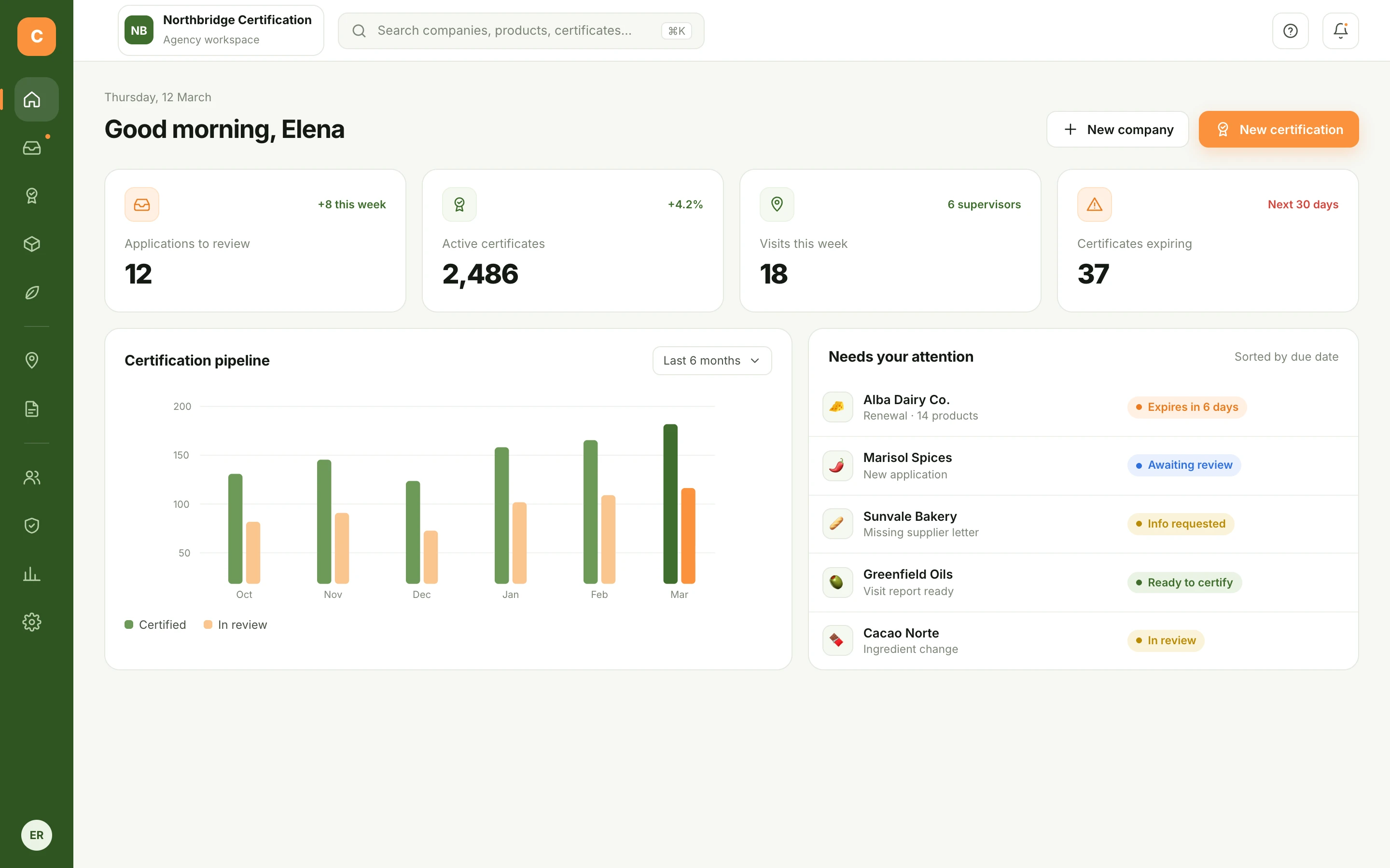
Agency dashboard with applications to review, active certificates, visits and expiring certificates
Agency dashboard · What needs a decision todayEnlarge screen ↗
My roleSole Product Designer

Research with the client, product model, flows, UI, design system, prototype and the product’s logo and identity.

ProductMulti-tenant SaaS

One platform hosting many certification agencies, each with its own team, clients and templates.

The scope58 screens · 4 roles

Applications, products, ingredients, inspections, field trips, roles, analytics and certificates.

Certa Admin is an anonymized identity for client work. Screens are redesigned portfolio reconstructions based on my original Figma flows, with illustrative data.

01 / The problem behind the brief

Getting certified meant a lot of emails, PDFs and spreadsheets.

A food company applies. The agency reviews documents, chases missing supplier letters, sends a supervisor to the facility, collects the inspection and finally issues a certificate that has to be renewed every year.

Each step belonged to a different person, and none of them shared a system. Status lived in someone’s inbox; the inspection checklist was a PDF printed per visit.

The client asked for an admin panel. While mapping the flows, it became clear they needed one place where every role could see and update the same application.

Before / Scattered work

Applications by email + PDF

Inspection checklists on paper

Visit planning in spreadsheets

Certificates tracked by hand

After / One certification record

Application → Review →
Visit → Certificate

Every role sees the same record, at its own step

Status, documents and decisions travel with the application instead of between inboxes.

02 / Design for every seat

Four types of users, each with a different job.

I mapped who acts at each step and what they are allowed to decide. That map became the navigation, the permissions and the empty states of the product.

◎Platform admin

Runs Certa itself

Onboards agencies, manages accounts, support tickets and default templates.

◆Agency superadmin

Owns the decisions

Reviews applications, issues and revokes certificates, manages the team and templates.

⌖Supervisors

Work in the field

One to many per agency. Visit facilities, complete inspections and submit evidence.

▣Client company

Pays to be certified

Applies, uploads documents, follows progress and downloads valid certificates.
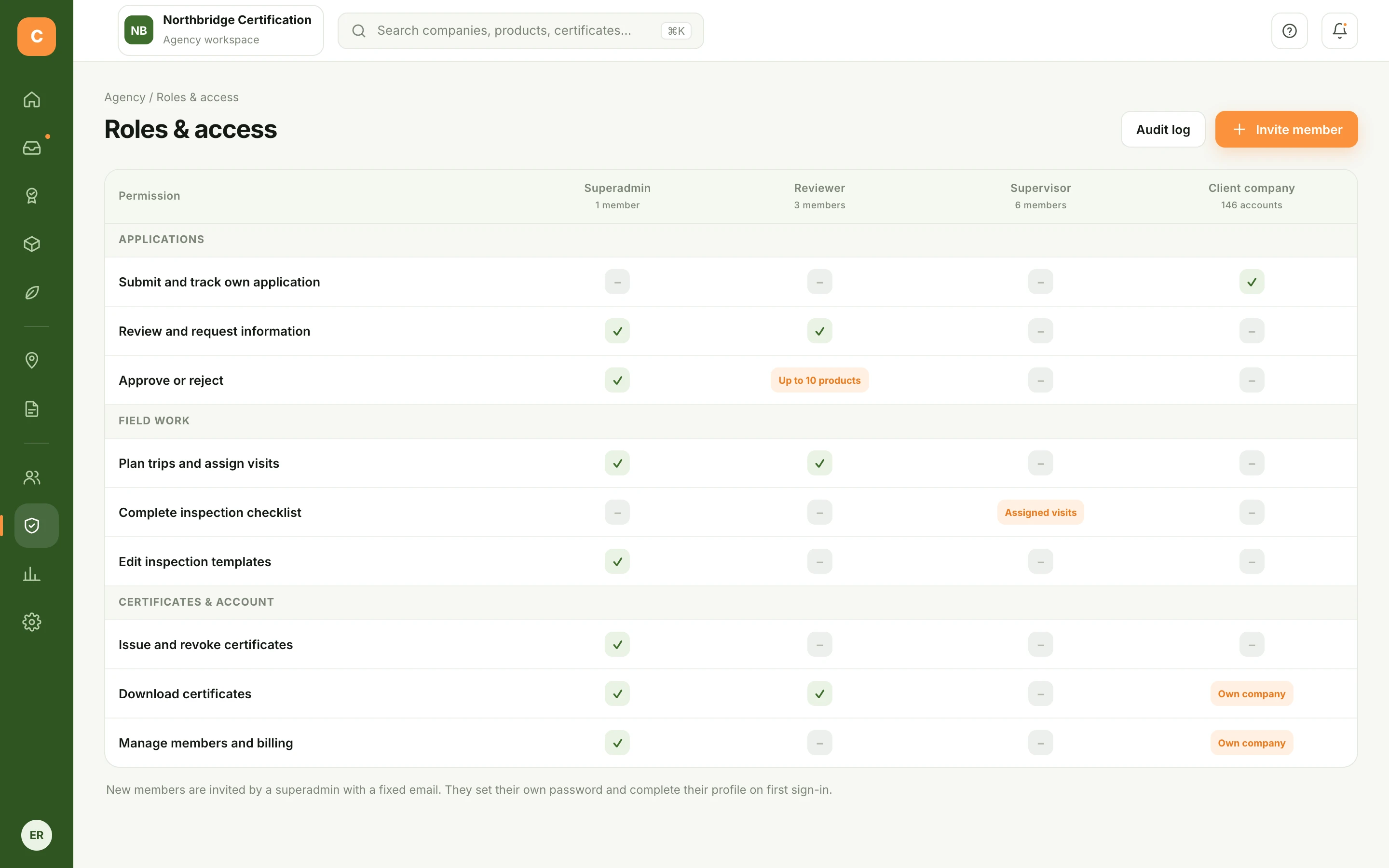
Roles and access matrix with scoped permissions for superadmin, reviewer, supervisor and client company
Roles & access · Permissions with scope, like “own company” or “assigned visits”Enlarge screen ↗

03 / Decisions that shaped the experience

From application
to certificate.

Five workflows, following the certificate from application to seal.

01 / Applications pipeline

Showing where each application is.

Agencies receive applications, renewals, product additions and ingredient changes. In one list they all looked the same.
The decision
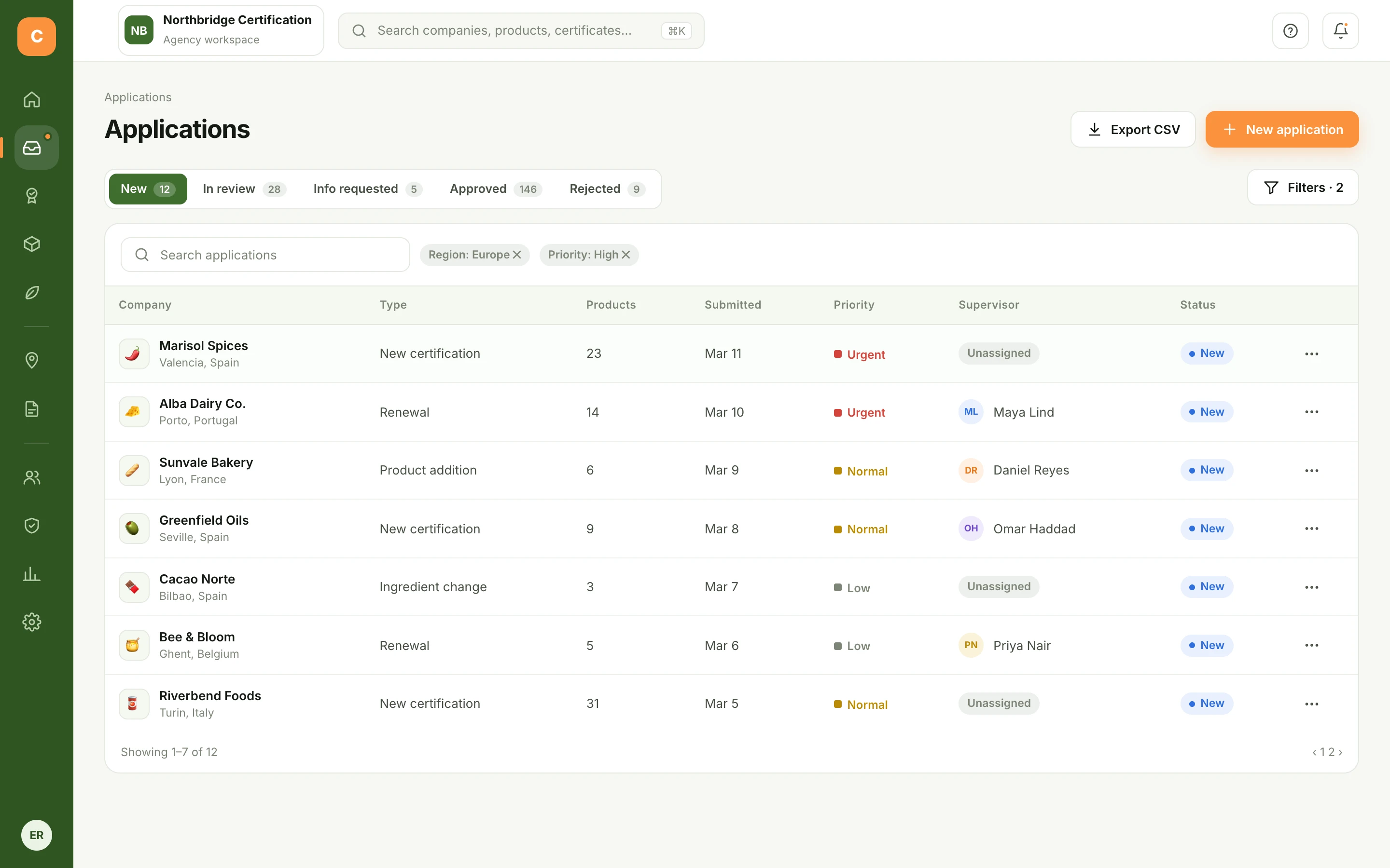
Status tabs mirror the real stages (new, in review, info requested, approved, rejected) with live counts, so the queue reads as a pipeline.
The guardrail
Priority and supervisor are visible on every row. Rows without a supervisor say “Unassigned” instead of leaving the cell empty.
Why it matters
The superadmin can tell in seconds which work is waiting on them and which is waiting on someone else.
Applications list with stage tabs, filters, priority and supervisor columns
Applications · Stages, priority and ownershipEnlarge screen ↗
02 / Application review

Reviewing an application without leaving the list.

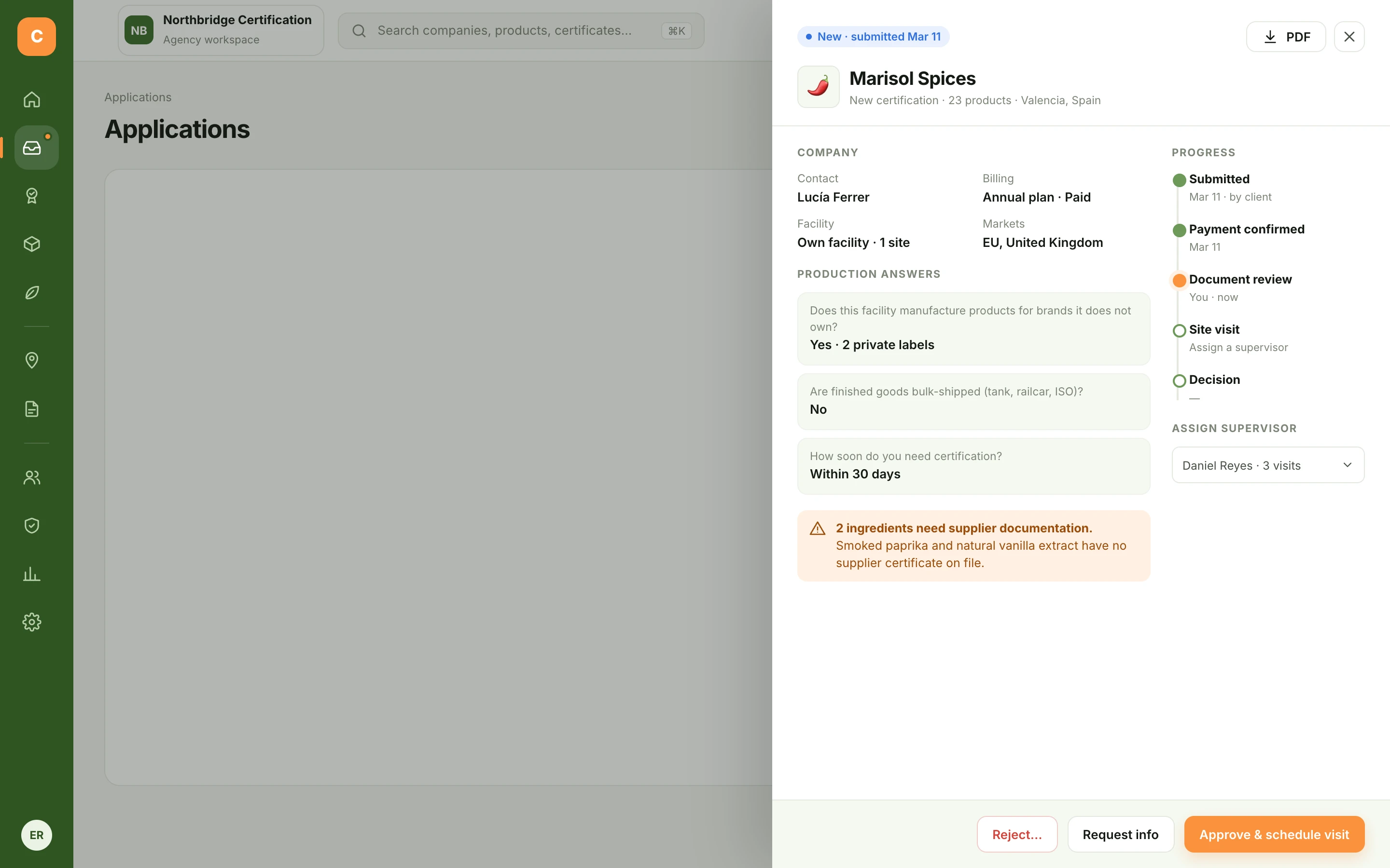
The original application was a long form opened as a modal: everything the company typed, in order, with no hint of what mattered.
The decision
A side panel keeps the list visible, groups answers by what the reviewer checks, and shows problems first, like ingredients without a supplier certificate.
The guardrail
Reject always asks for a reason the client can act on. “Request info” is its own path, so an incomplete application doesn’t look like a rejected one.
The next step
Approving and assigning a supervisor happen together, so no approved application is left without a visit.
Application detail side panel with company data, production answers, a missing-documents warning, progress timeline and supervisor assignment
Application detail · Problems first, then the decisionEnlarge screen ↗
03 / Inspection templates

Letting each agency build its own inspection checklist.

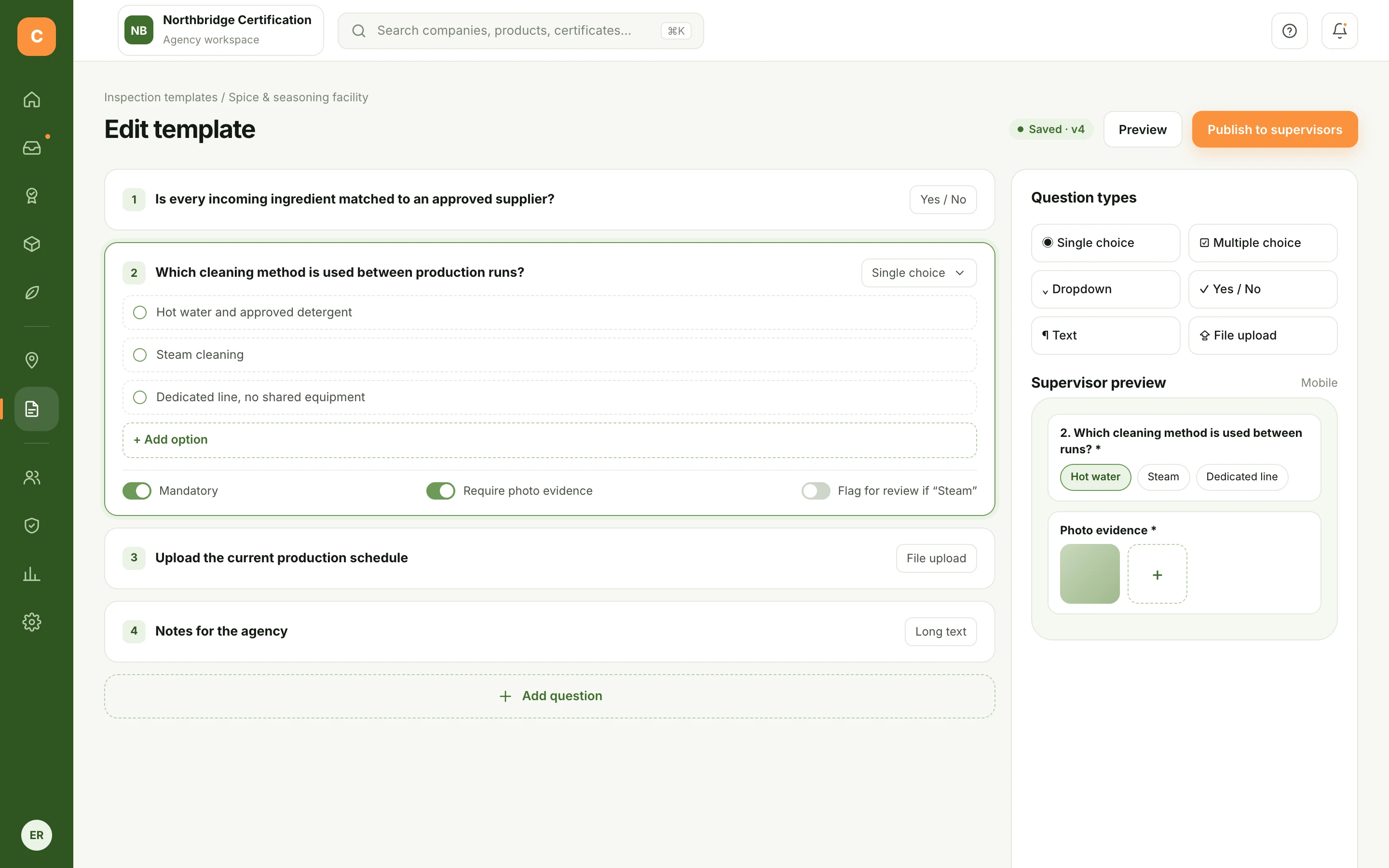
Every agency inspects differently, and the questions change by facility type. Hard-coding the checklist would have made the product a bottleneck.
The decision
A template builder with six question types, mandatory and photo-evidence toggles, and versioning before anything reaches supervisors.
The guardrail
A live supervisor preview shows how each question will look on a phone in the field, where it will actually be answered.
Why it matters
Agencies adapt the product to their standard without asking for development work.
Inspection template builder with question types, mandatory and photo evidence toggles and a mobile preview
Template builder · Configurable, with a field previewEnlarge screen ↗
04 / Field work

Planning visits with each supervisor’s workload in view.

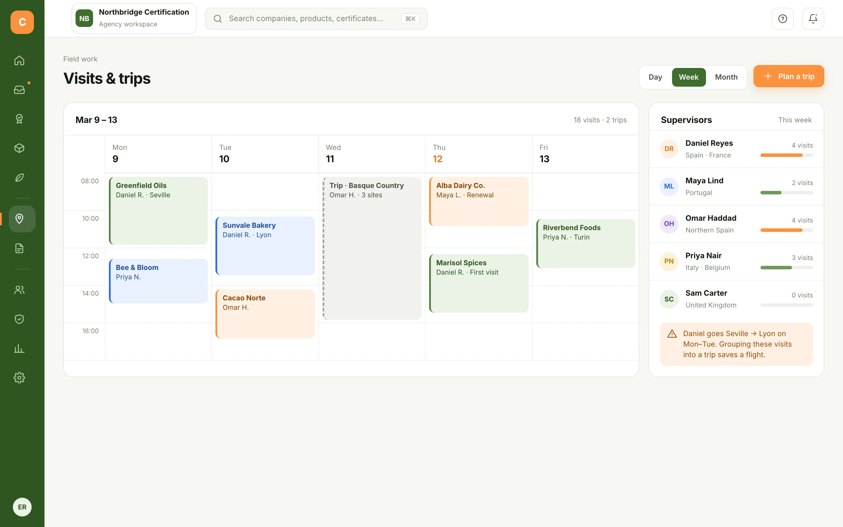
Supervisors travel between countries. The original trip manager listed trips; it did not show who was overloaded.
The decision
A week view of visits and multi-site trips, next to each supervisor’s load for the week.
The guardrail
Conflicts and inefficient routes are pointed out before they become a problem, and the screen suggests a fix.
In the field
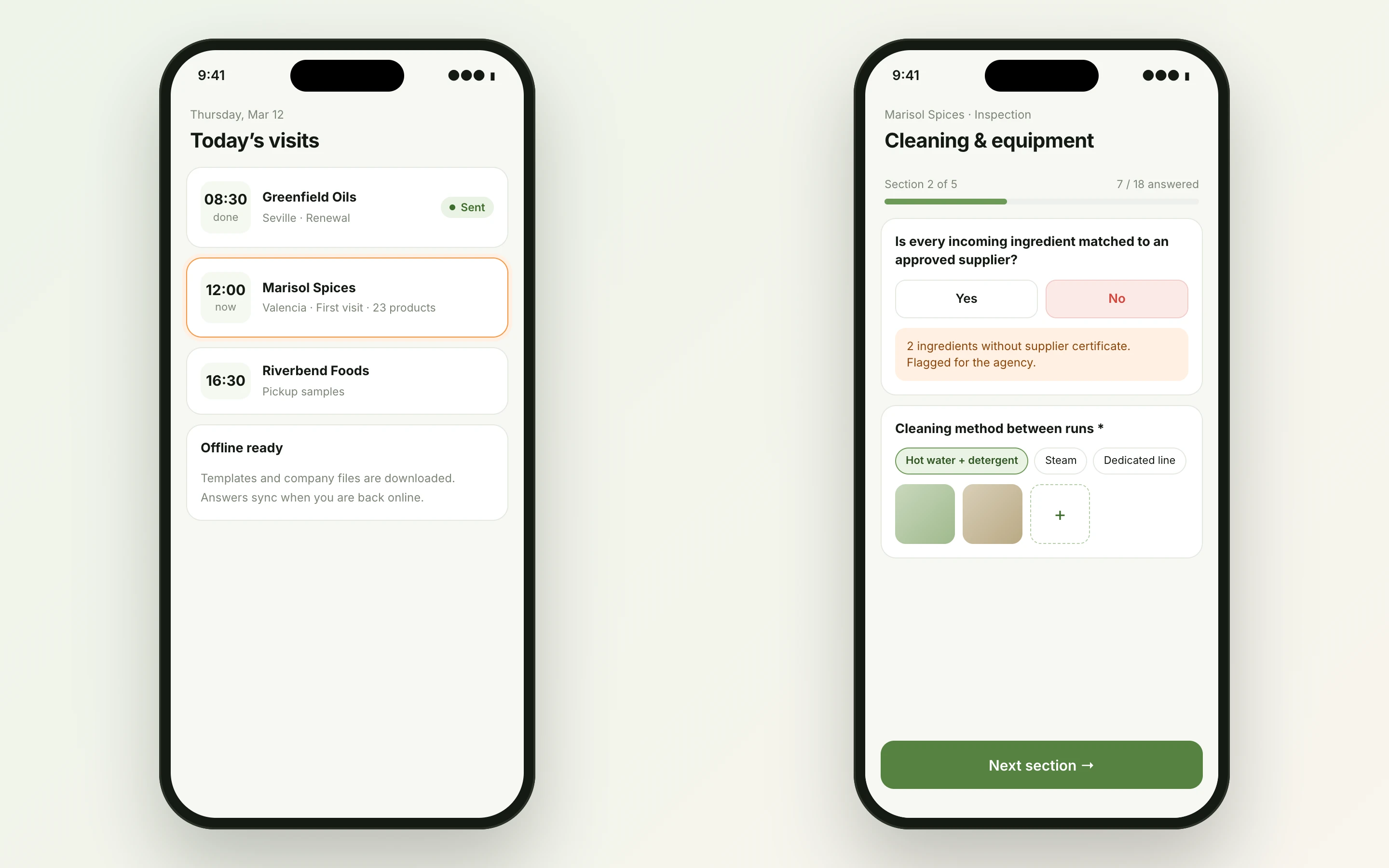
Supervisors get a mobile view of today’s visits and the inspection itself, ready offline, with photo evidence and automatic flags back to the agency.
Weekly visits and trips calendar with supervisor workload and a routing suggestion
Visits & trips · Workload next to the calendarEnlarge screen ↗
Supervisor mobile screens: today's visits and an inspection section with yes/no answers, flags and photo evidence
Supervisor mobile · Today’s visits and the inspection checklistEnlarge screen ↗
05 / The client portal

A portal for the company getting certified.

The original product had no view for the company being certified. Every status question became work for the agency.
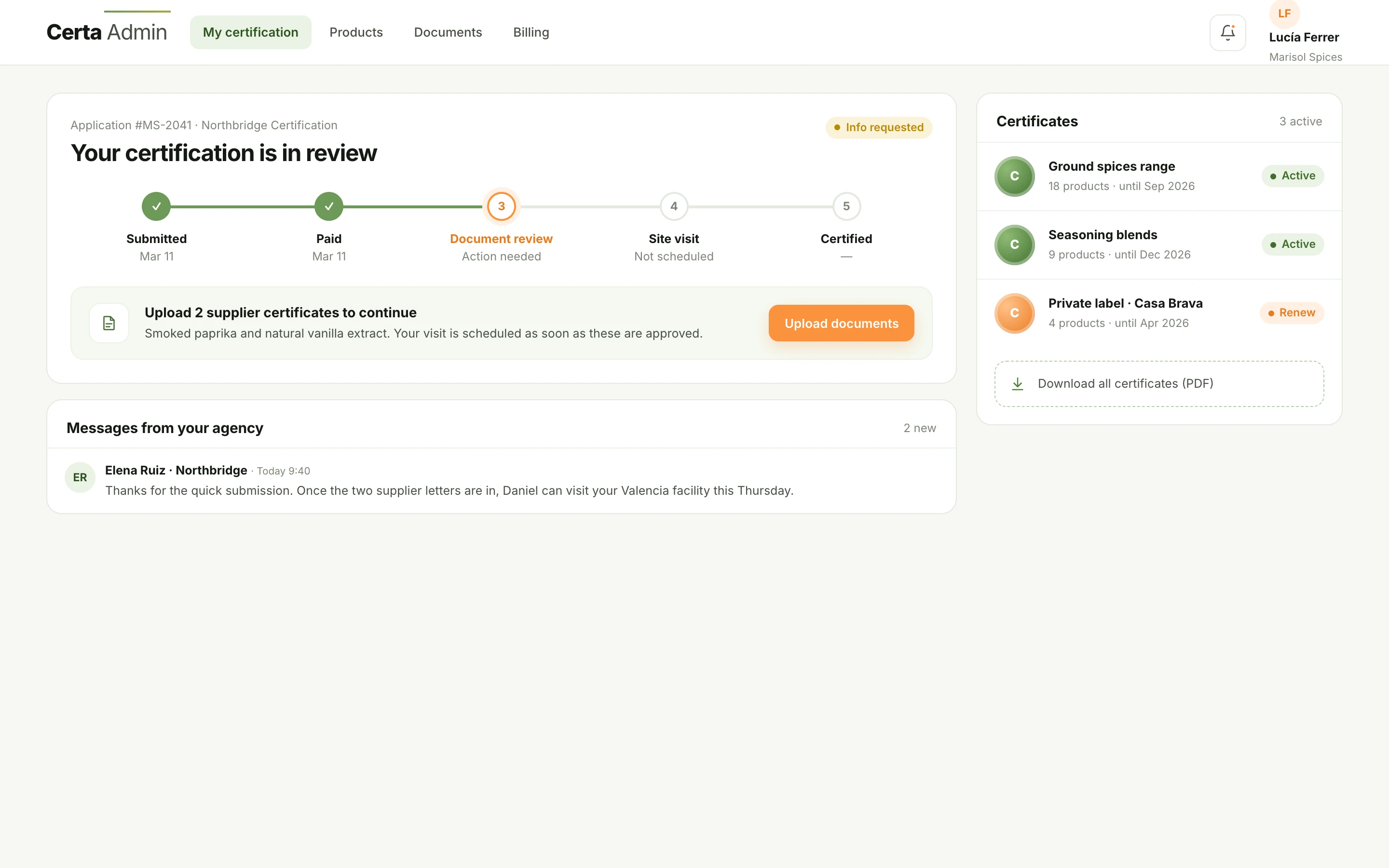
The decision
A portal built around one question: what is the status, and what do I need to do next?
The guardrail
The next action is always explicit, with the reason, so “info requested” never reads as a rejection.
Why it matters
Certificates, renewals and messages live with the application, so fewer status questions reach the agency.
Client portal with a five-step certification tracker, next action, agency messages and active certificates
Client portal · Status, next action and certificatesEnlarge screen ↗

06 / One product, one language

The brand and the UI system.

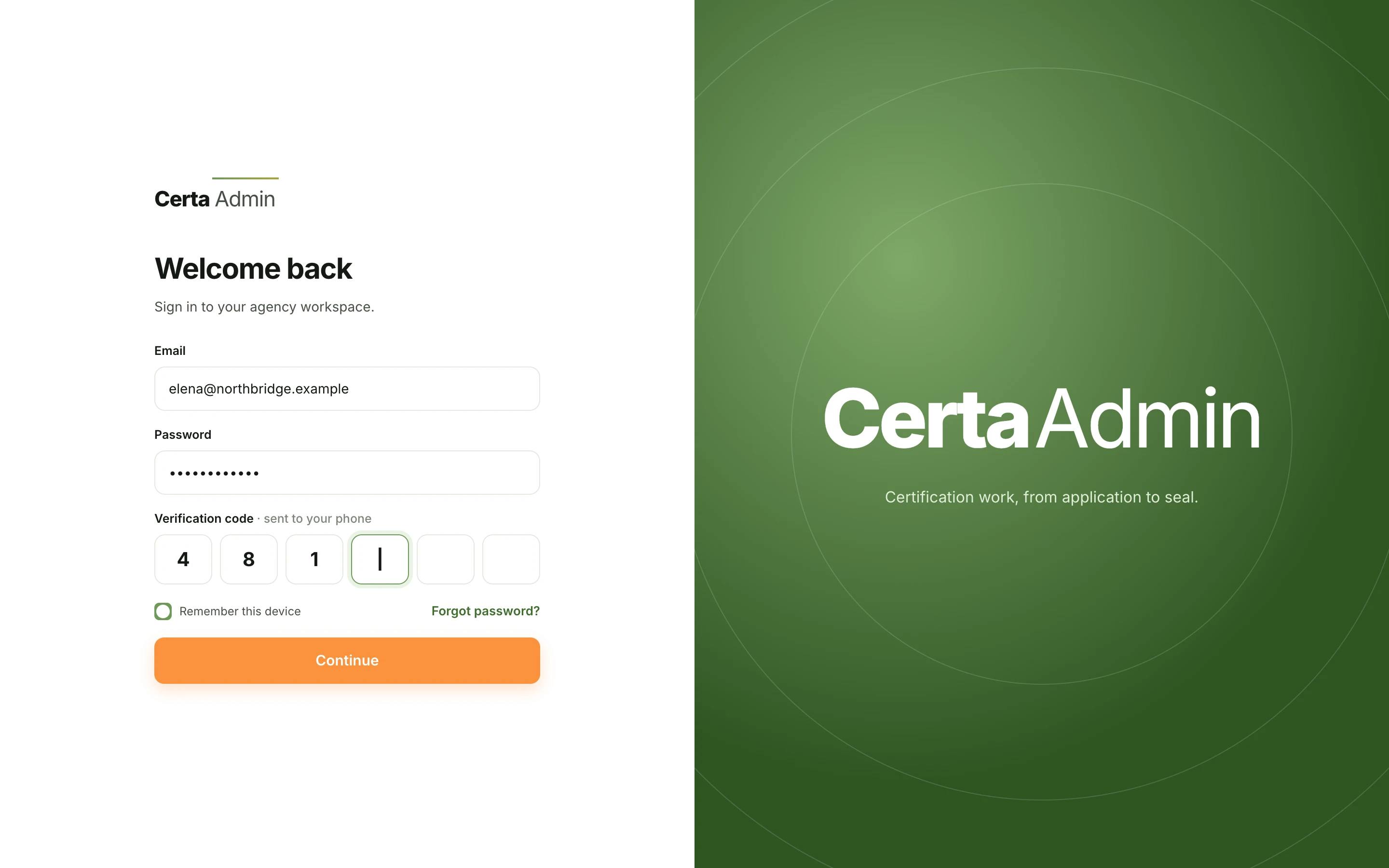
I designed the product identity as well: a wordmark with a growing arc, a natural green for structure and trust, and an orange reserved for the primary action on every screen.

The same rules carry into status: each stage of a certificate has one color and one meaning across tables, timelines, chips and the client portal.
Brand / Deep green#3F6E2E
Structure#6D9957
Primary action#FB923C
AaInter
Dense data, calm hierarchy.
NewIn reviewInfo requestedCertifiedExpiringRejected
Sign in screen with email, password and one-time code, next to the Certa Admin wordmark
Identity · Sign in with one-time code
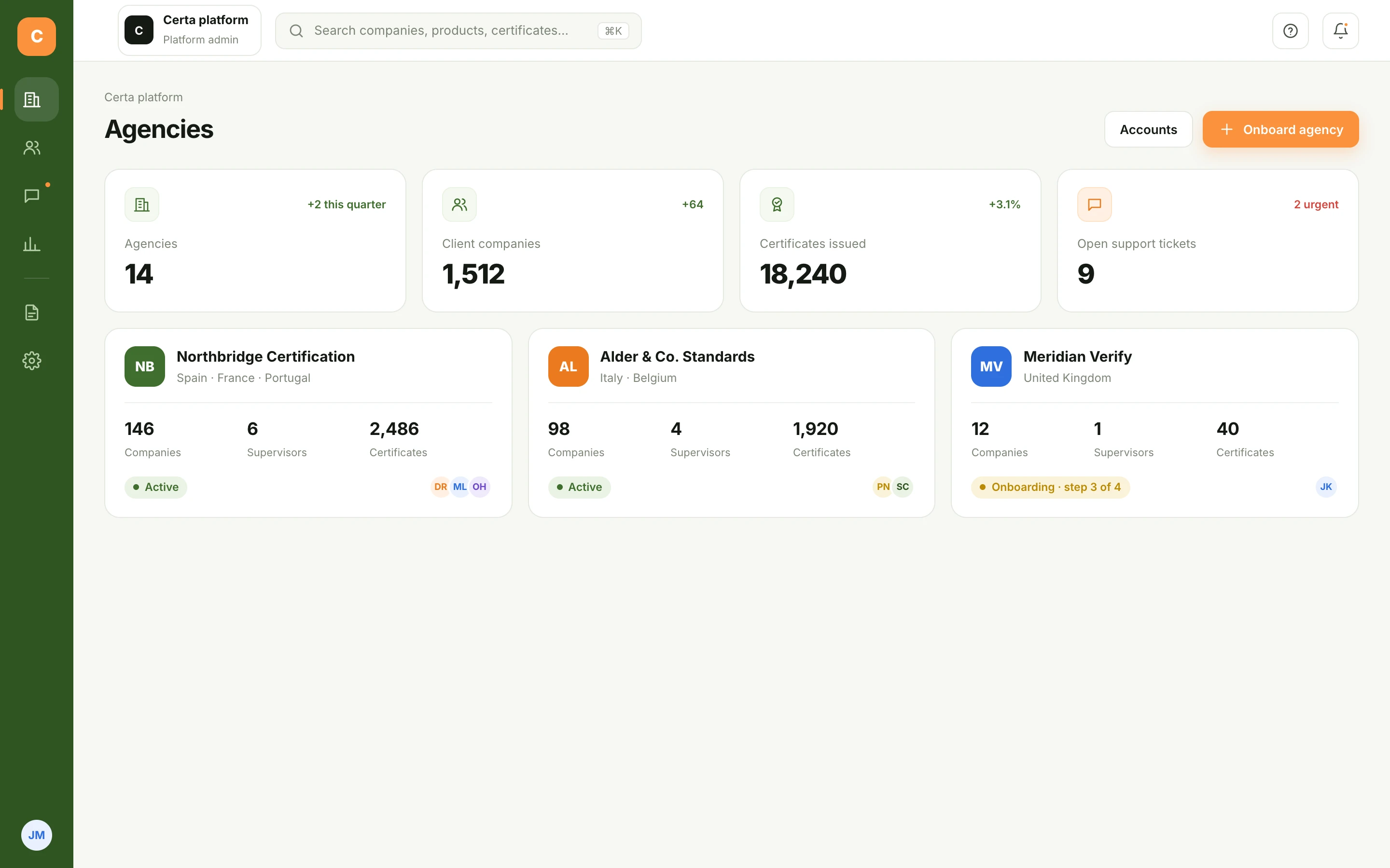
Platform admin view listing certification agencies with companies, supervisors and certificates
Platform admin · Many agencies, one product
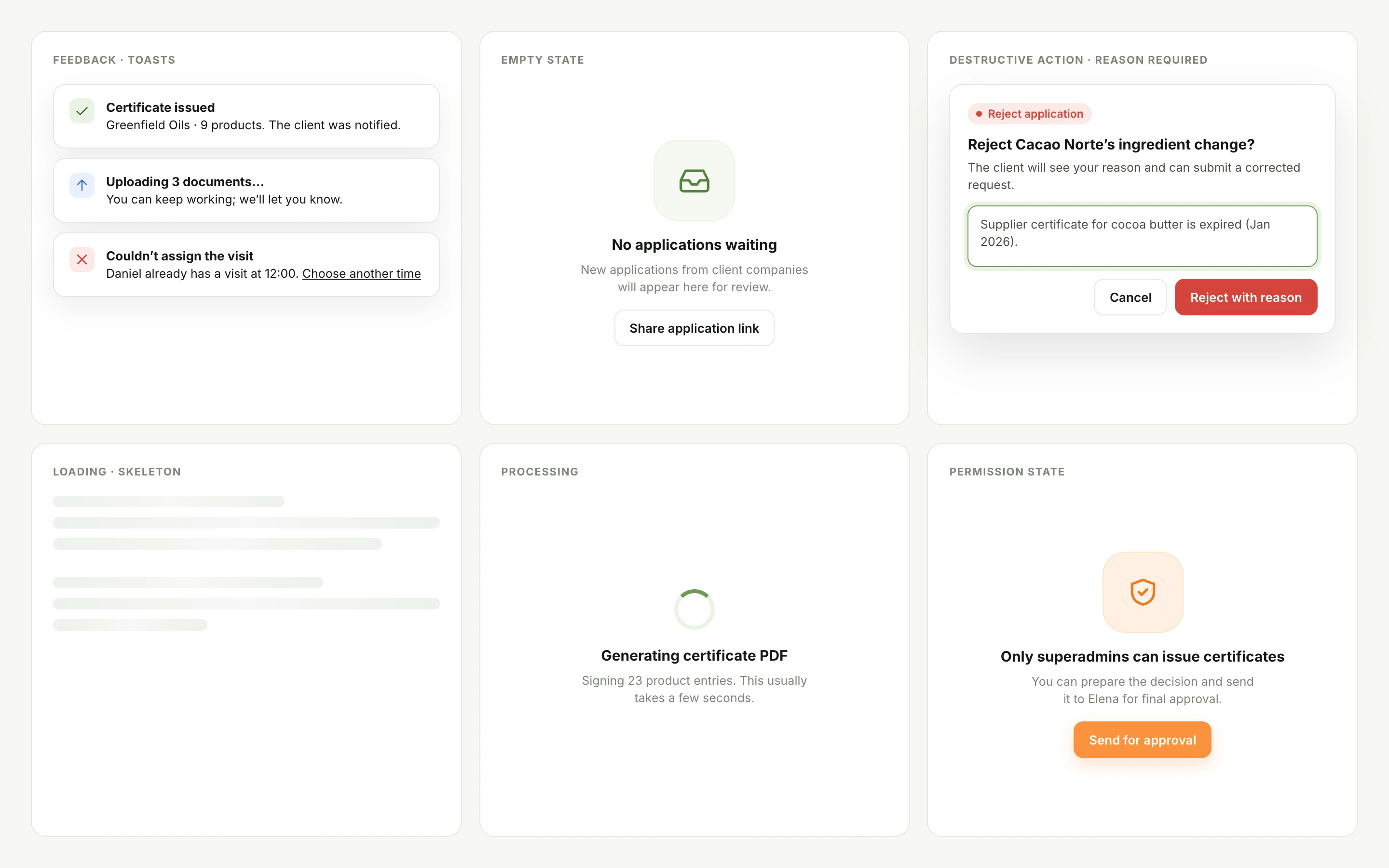
Interface states: toasts, empty state, reject with reason, skeleton loading, processing and permission state
States · Feedback, empty, loading, destructive and permission statesEnlarge screen ↗

Users are invited.

Superadmins create members with a fixed email; new users set their password and finish their own profile.

Destructive actions need a reason.

Rejecting or revoking requires a reason the other side can read and act on.

Permission limits are explained.

When a role can’t act, the screen says why and offers the next best step.

07 / Where it landed

Where it ended up.

I delivered the full design: product model, role map, 58 screens across two admin levels, the inspection template system, field and trip management, analytics and the brand identity. The product had not been implemented when my engagement ended.

For this case I redesigned the interface on top of those flows and added the client portal and supervisor mobile view, the two seats the original scope left out.

What I would do earlier: design the client’s view from day one. Most of the agency’s manual work was answering questions the client could have answered by themselves.