Design a mobile food delivery experience where users can discover restaurants, compare options and place orders from one clear flow.
Case study / Mobile commerce
A food delivery app concept built around faster choice-making.
DeliveryYa explores a mobile ordering experience for moments when users want to quickly compare restaurants, browse food categories, customize items and complete an order without unnecessary friction.
Mobile UX
Food Delivery
Filters
Ordering Flow
UI Concept
UX/UI Designer across app structure, category browsing, filtering, item detail screens, ordering states and visual direction.
Reduce decision fatigue through clear categories, practical filters, readable restaurant cards and predictable customization patterns.
Story
Helping users move from craving to order with less hesitation.
The concept focuses on the everyday food-ordering journey: users arrive with a broad intention, narrow their options through food categories and filters, compare restaurants, customize an item and continue toward checkout.
The design prioritizes recognizable mobile patterns, strong visual food cues and clear hierarchy so the interface feels direct, practical and easy to scan.
01 / Product Flow
Discovery, comparison and customization in one mobile journey.
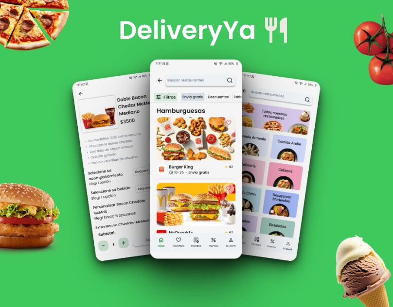
The screen set explores the core path of a delivery app: category discovery, restaurant browsing, filters, item details, add-ons and order preparation.
- Restaurant cards surface ratings, delivery context and product imagery.
- Filters help users narrow choices by delivery, offers and food type.
- Item customization makes modifiers and add-ons visible before checkout.
02 / UI Direction
A bright consumer interface kept secondary in the portfolio.
This project adds range to the archive without competing with the main B2B and systems-focused case studies. It shows mobile commerce thinking, visual polish and familiarity with consumer product patterns.