Define a digital launch strategy for a thematically dense RPG while keeping the first user journey clear, persuasive and easy to enter.
Case study / Game UI + launch strategy
Designing conversion and immersion for a dark fantasy RPG launch.
This concept explores how a complex game IP can launch through two connected experiences: a high-conversion landing page and a scalable home page architecture for deeper product storytelling.
Game UI
Landing Page
Conversion
Mobile UX
Visual Direction
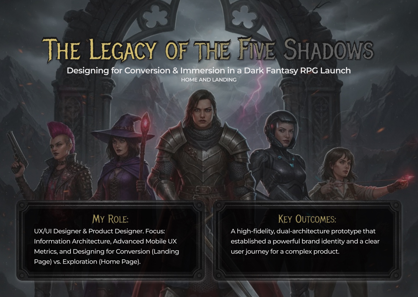
Product Designer across UX/UI direction, information architecture, conversion strategy, mobile UX and visual system decisions.
A responsive dual-architecture concept: landing page for pre-order conversion and home page for immersive product exploration.
Story
Balancing narrative depth with a clear product journey.
The product needed to feel atmospheric without becoming hard to use. I approached the work as a balance between immersion and action: users should understand the world, the offer and the next step without fighting the interface.
The result separates two jobs: a landing page designed for urgency and conversion, and a home page designed for discovery, lore and product information.
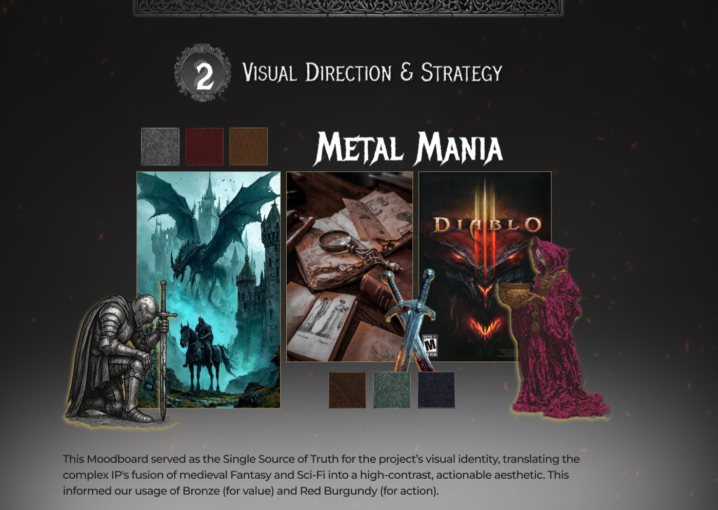
01 / Visual Direction
A visual system that turns genre into usable interface rules.
The moodboard translated the RPG world into concrete interface decisions: high contrast, metallic textures, bronze accents, red action moments and dark atmospheric surfaces.
- Built a visual direction that supports fantasy and sci-fi cues.
- Defined color roles for value, urgency, structure and action.
- Kept UI components readable inside a high-atmosphere brand world.
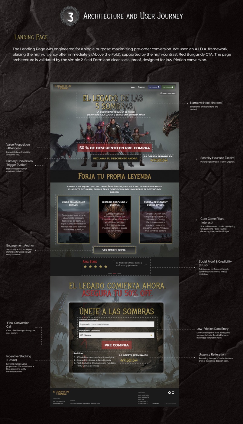
02 / Architecture
A landing page built around attention, desire and action.
The landing page uses a direct conversion path: immediate narrative hook, visible offer, high-contrast call to action, social proof, product pillars and low-friction form entry.
- Placed the primary offer and CTA above the fold.
- Used urgency and incentive stacking without hiding key details.
- Reduced the form to the minimum information needed to convert.
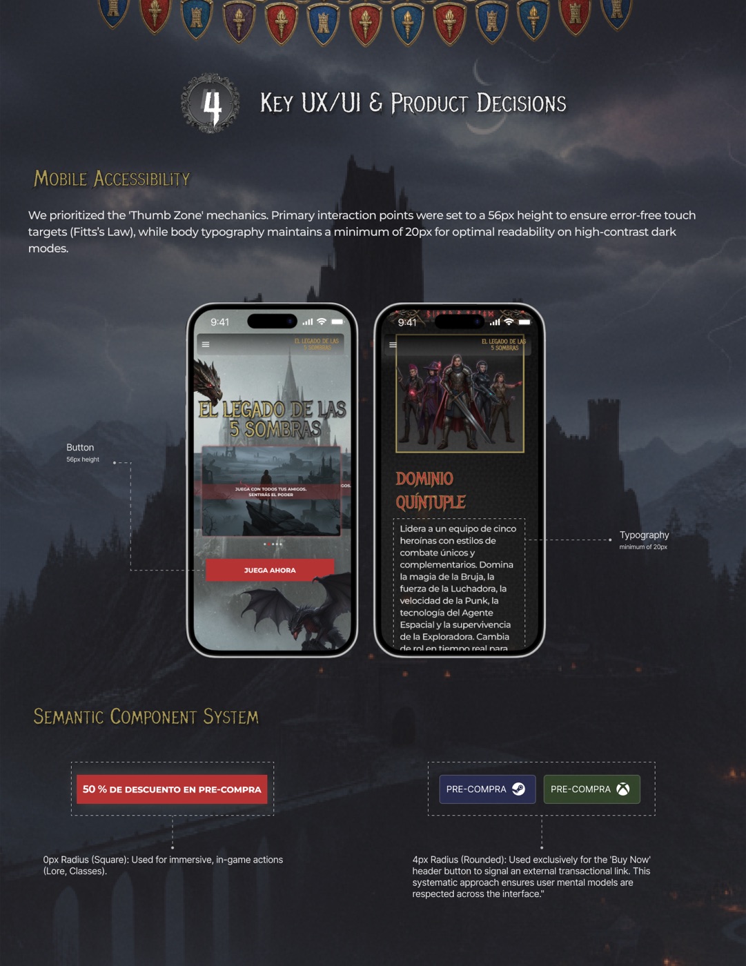
03 / Mobile UX
Mobile decisions shaped around readability and touch precision.
The mobile experience prioritizes thumb-zone access, clear content chunks, legible type and action components that feel native to the game world while still behaving like reliable product UI.
- Used 56px interaction targets for key mobile actions.
- Maintained readable typography in a high-contrast dark interface.
- Created semantic button patterns for primary conversion moments.
04 / Prototype Direction
A launch ecosystem designed to feel immersive and measurable.
The case demonstrates how visual storytelling, product architecture and conversion mechanics can work together. The interface keeps the fantasy atmosphere, but every section still has a clear product role.