Explore and ask
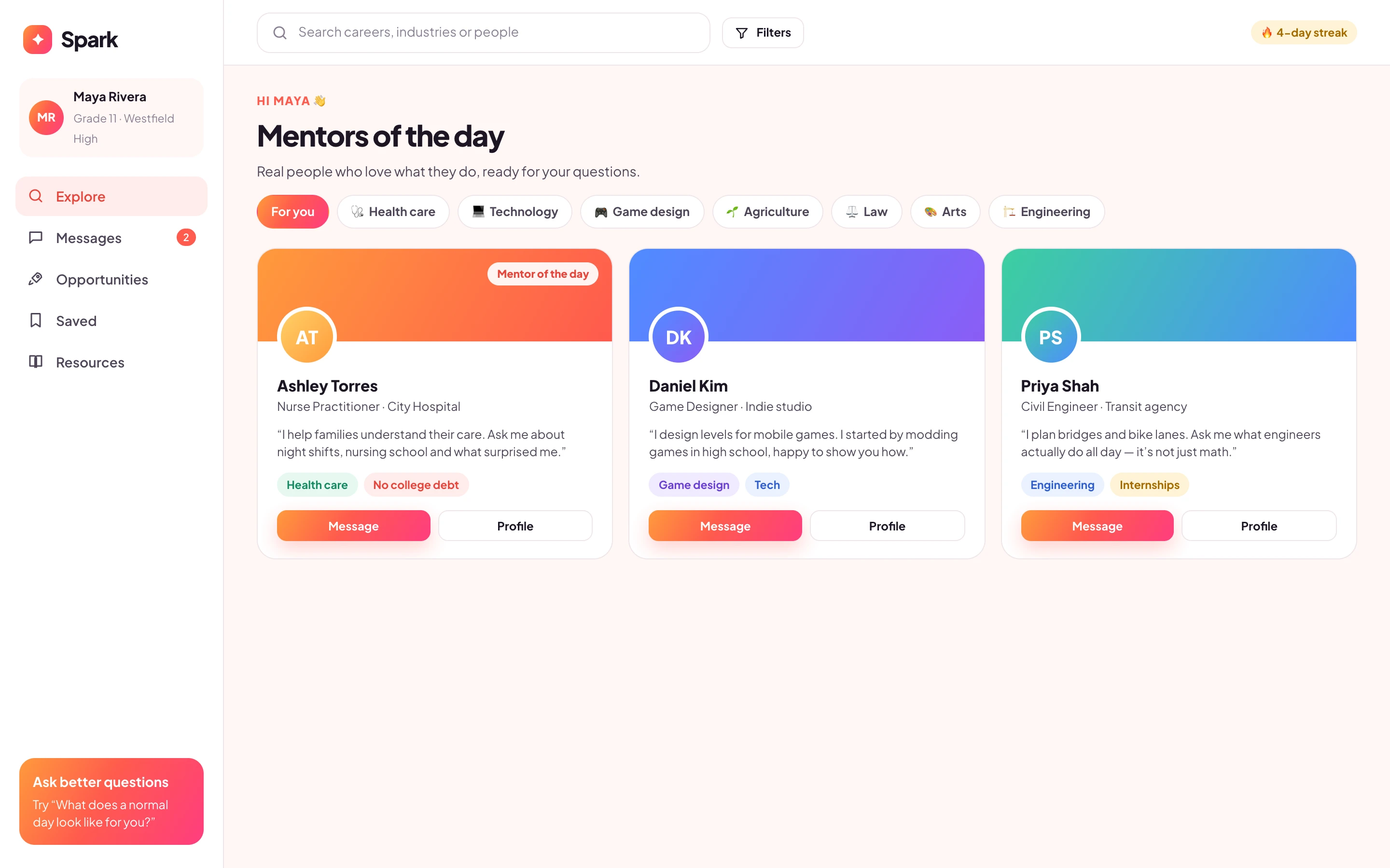
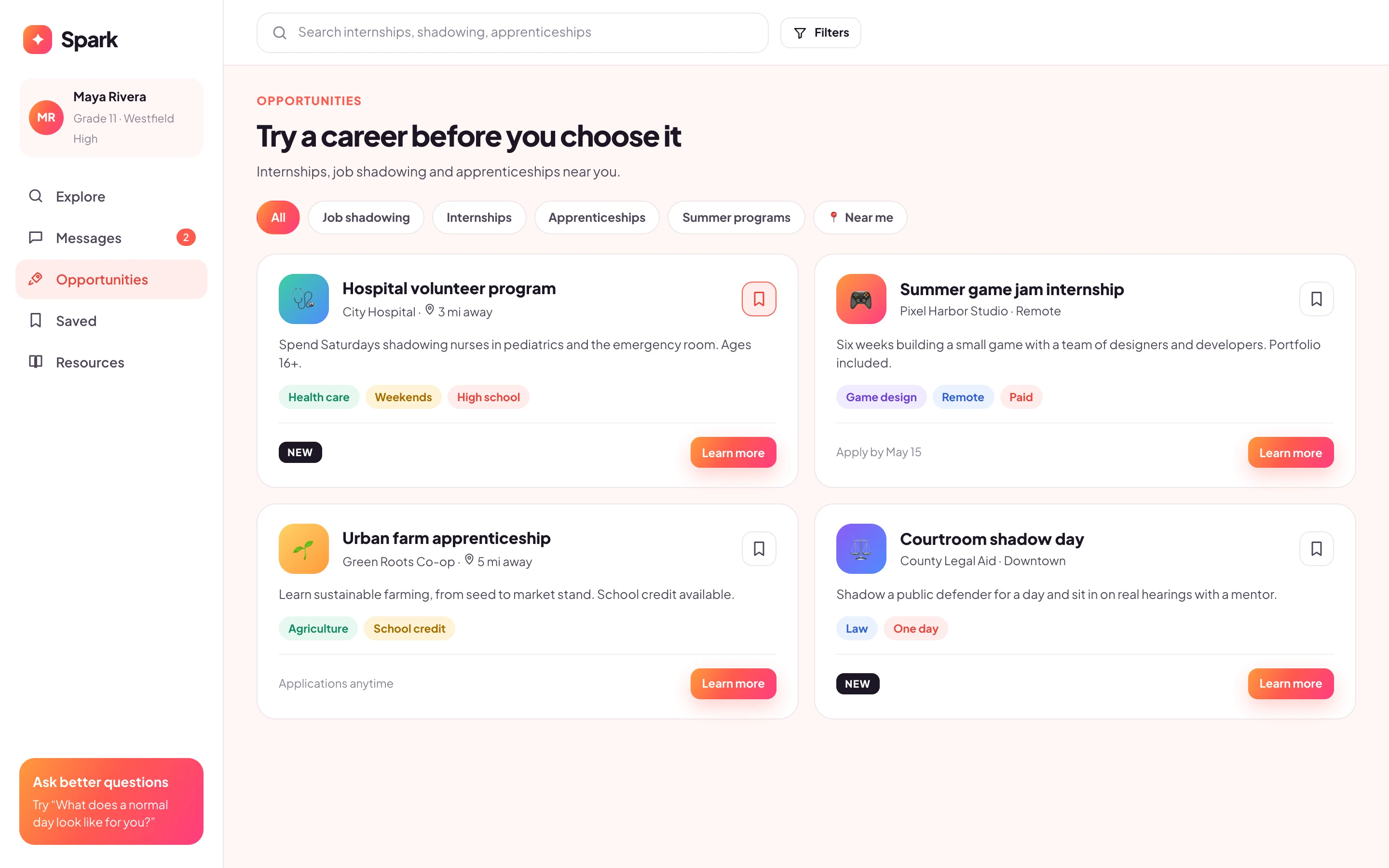
Browse mentors, chat, save people and opportunities, and try careers through shadowing and internships.
UX/UI design · Multi-role product · Visual identity · Growth model
Spark connects high school students with professionals who mentor them, with teachers who guide them and with internships they can actually apply to. I redesigned the product end to end, from roles and flows to a brand that feels young and optimistic.
Explore the decisions ↓A career platform for teenagers felt formal and confusing, and roles weren’t clear.
Sole UX/UI Designer at a product agency: roles, flows, interface and visual direction.
Redesigned for students, teachers and mentors and shipped to production.
Research, information architecture, flows, interface, visual direction and handoff, at a low-code product agency.
Students, teachers and mentors. Students join through their high school; nobody signs up on their own.
Built on a low-code stack and released after validation with schools.
Spark is an anonymized identity for client work. Screens are redesigned portfolio reconstructions based on my original files, with illustrative people, schools and organizations.
01 / The problem behind the brief
The first version worked, but it was hard to read and harder to trust. Students, teachers and mentors saw similar screens, so nobody knew what was meant for them.
The founder’s brief was simple: make it feel young, colorful and hopeful, and make it obvious what each person should do next.
It had to feel fun for 16-year-olds and still be clear and safe enough for schools to approve.
02 / Three roles
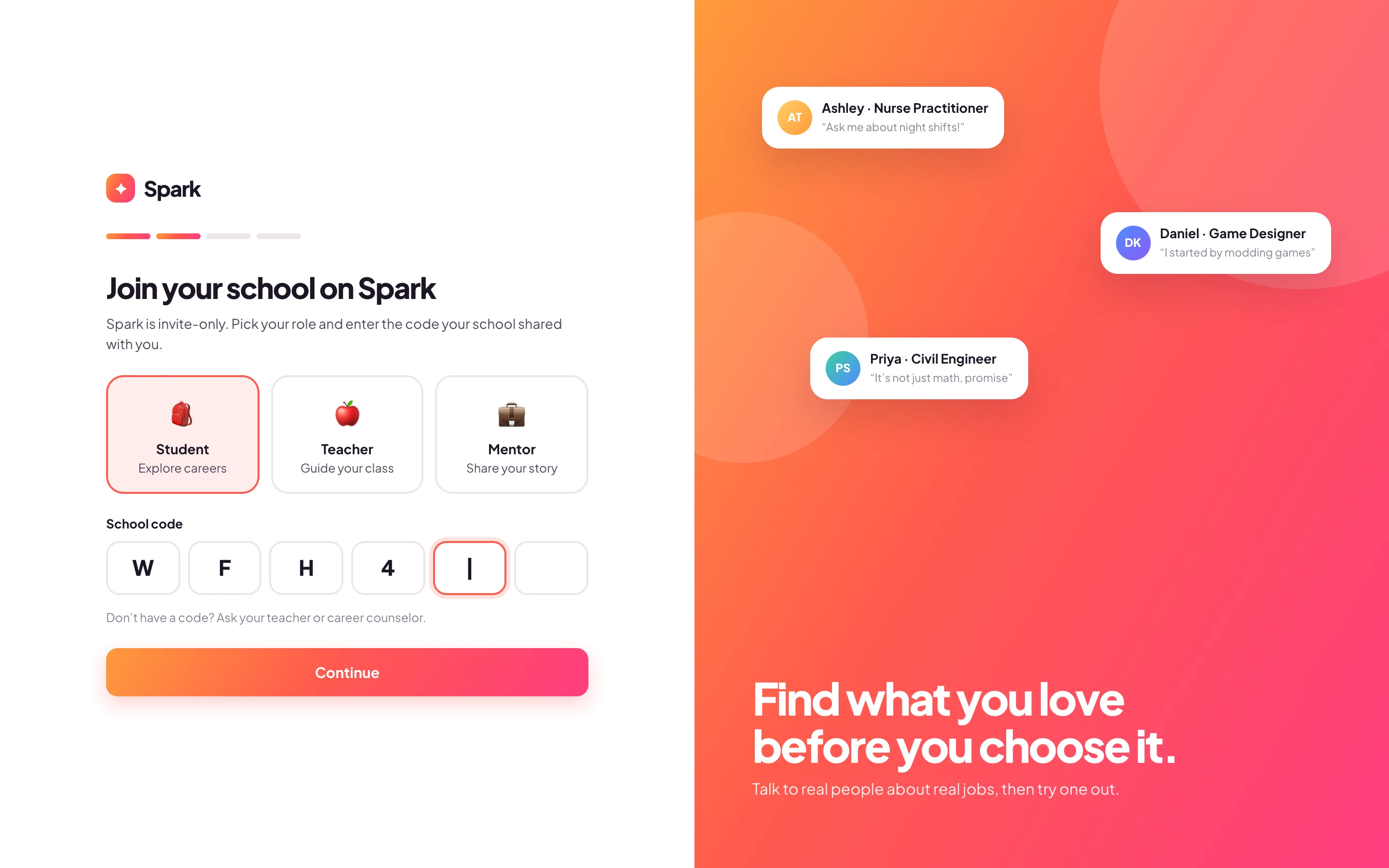
Access starts with a school code, so every student arrives through an adult who is responsible for them. From there, each role sees only what it needs.
Browse mentors, chat, save people and opportunities, and try careers through shadowing and internships.
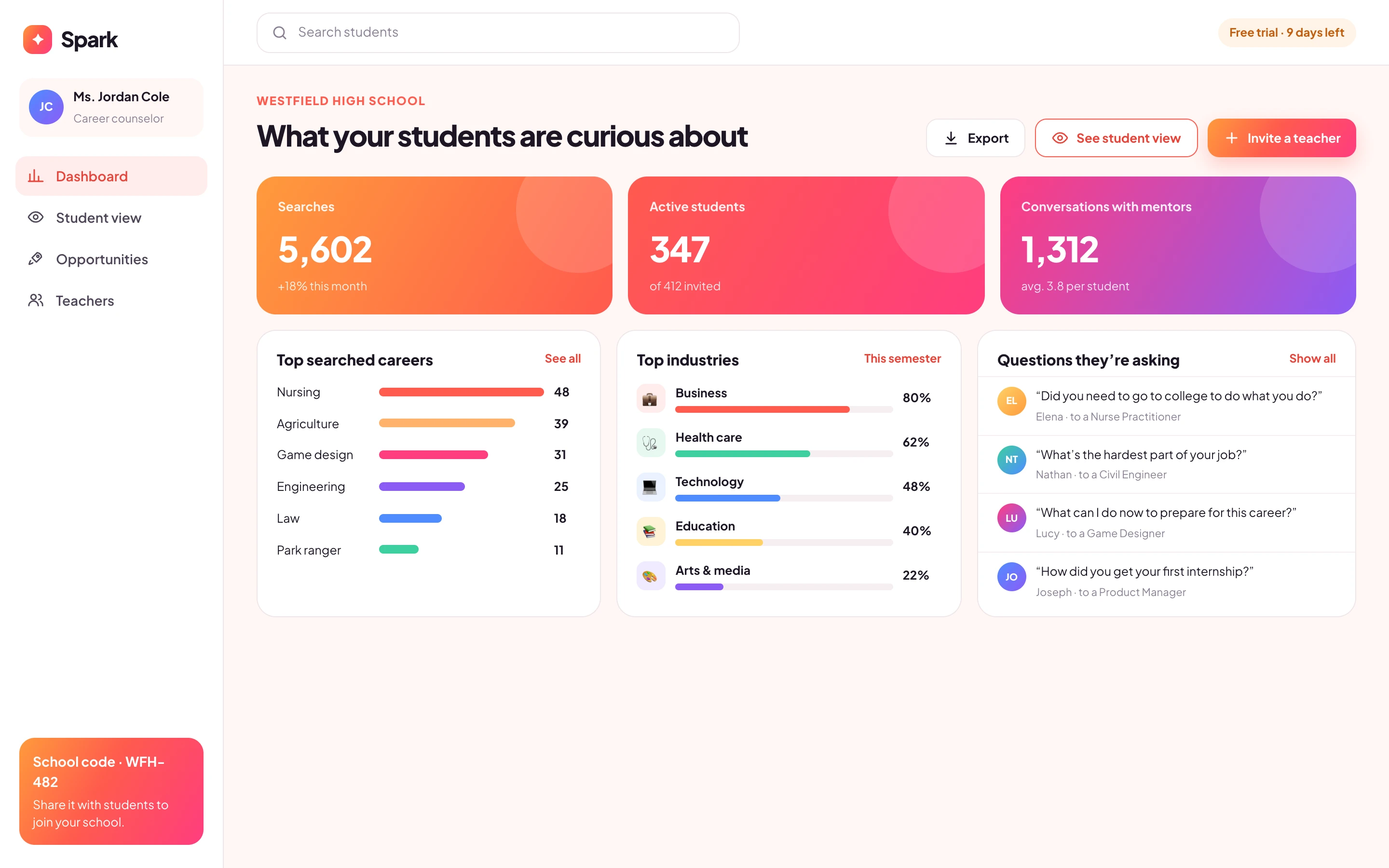
Invite students, see what they are curious about and preview the student experience in a safe demo mode.
Real professionals who answer questions and post opportunities from their organizations.
03 / Decisions that shaped the experience
Four decisions across the student and teacher experience.
Teenagers don’t search for “operations management”. They respond to a person who tells them what their day is like.
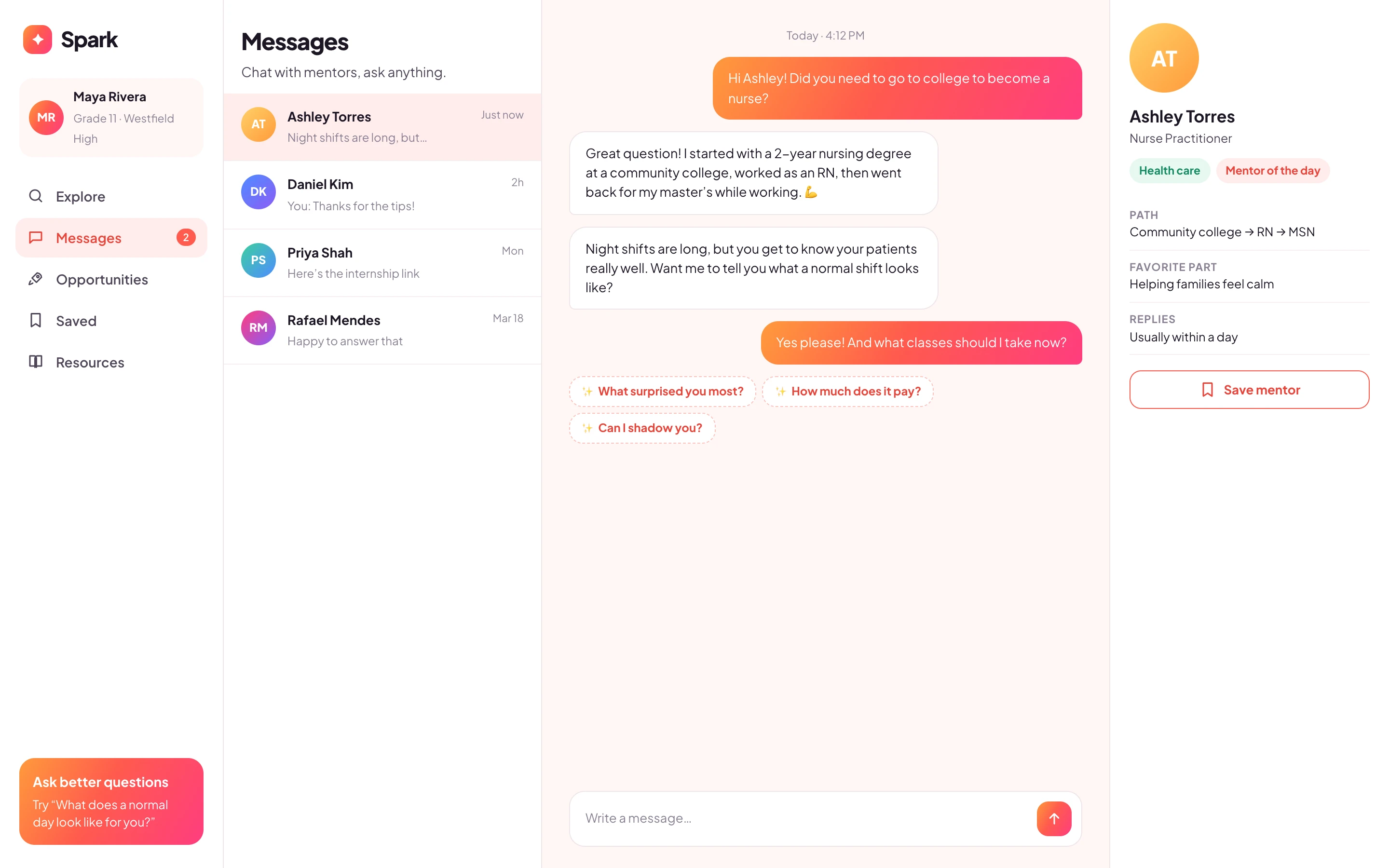
The hardest part of messaging a professional is knowing what to say. Many conversations never started.
Counselors had no way to see what students were exploring, so career guidance stayed generic.
Talking to a mentor is the start. Students needed somewhere to go next.
04 / Growth model
Schools buy software slowly. Teachers needed time to prove value before a principal or district would pay.
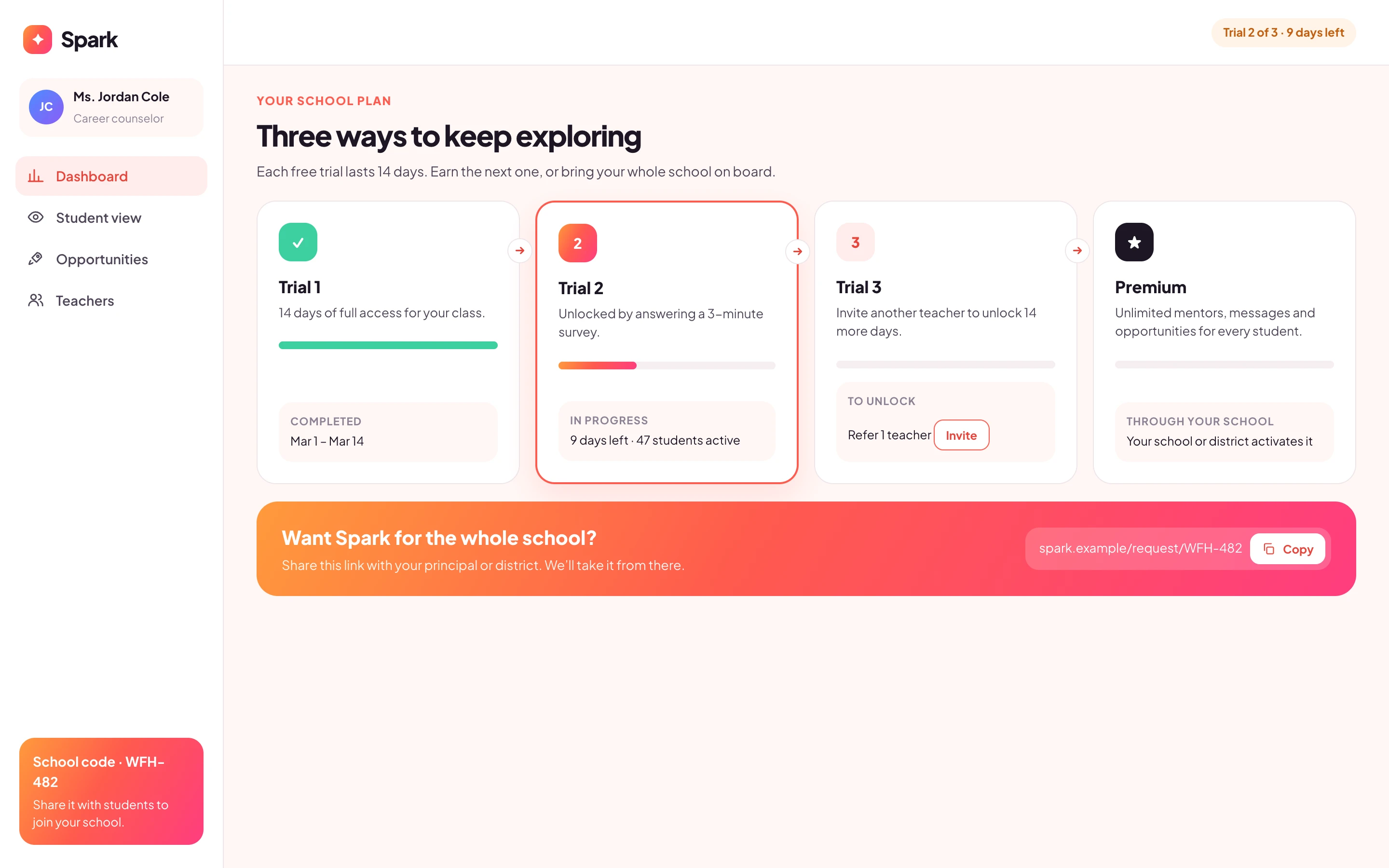
I designed a three-step trial: 14 days free, a second period unlocked by a short survey, a third unlocked by inviting another teacher, then a request link to share with the school. Each step gives the teacher more time and gives the team feedback or a new contact.
When a trial ends, the screen always tells the teacher what they can do next, like inviting a colleague or sharing the request link.
05 / Where it landed
I delivered the full product design: role model, onboarding, student, teacher and mentor experiences, the trial and premium flows, and a warm gradient identity built on coral, pink and a sunny accent.
The product shipped on a low-code stack; I left the agency during validation, so I don’t have post-launch metrics to report.
What I would do earlier: test question prompts with real students in the first week. Small copy changes in the chat had more impact on engagement than any layout change.