Product strategy · Interaction design · Design systems
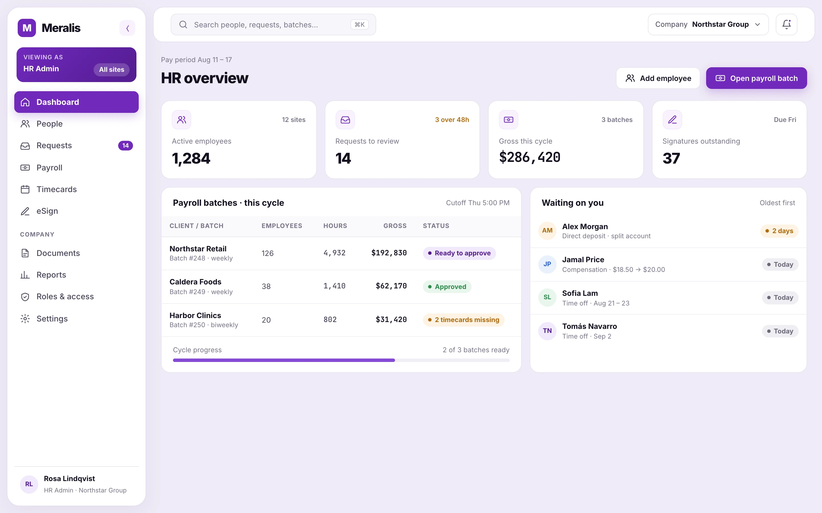
HR and payroll for nine roles
that share one employee record.
Meralis runs HR for people who are already hired: their records, requests, documents and pay. I designed the product logic and interfaces so every role has a clear scope and every approval has a visible consequence.
Explore the design decisions ↓HR and payroll software for nine roles, with access, approvals and documents scattered across separate screens.
Sole Product Designer: product model, flows, interface, design system and handoff.
Launched after years in development; used by around 200–300 people, with features shipping in one two-week sprint.
From product models and workflows to interfaces, prototypes and developer guidance.
Used by around 200–300 people together with its sister product.
Nine roles scoped by site and department, a unified requests hub, eSign, payroll batches and shared UI foundations.
Meralis is an anonymized identity for a live product at my current company. Screens are portfolio reconstructions with illustrative data; the case focuses on the design decisions behind them. Its sister product, a staffing marketplace, is covered in the Relay case.
01 / The problem behind the brief
The same employee looks different to every role.
A company with many sites employs people who can hold several assignments, each with its own site, department, rate and documents. HR, payroll, safety and line managers all touch those records.
Approvals lived in separate screens per request type, and access depended on what each screen asked for. The same manager could see a request in one place and an empty list in another.
My job was to make those relationships explicit before turning them into screens.
Time off approvals
Compensation changes
Direct deposit updates
One person.
Several assignments.
Employee → Assignments → Scoped roles → Actions
Every request, document and paycheck keeps the assignment it belongs to.02 / Start with authority
Access depends on the person’s assignments.
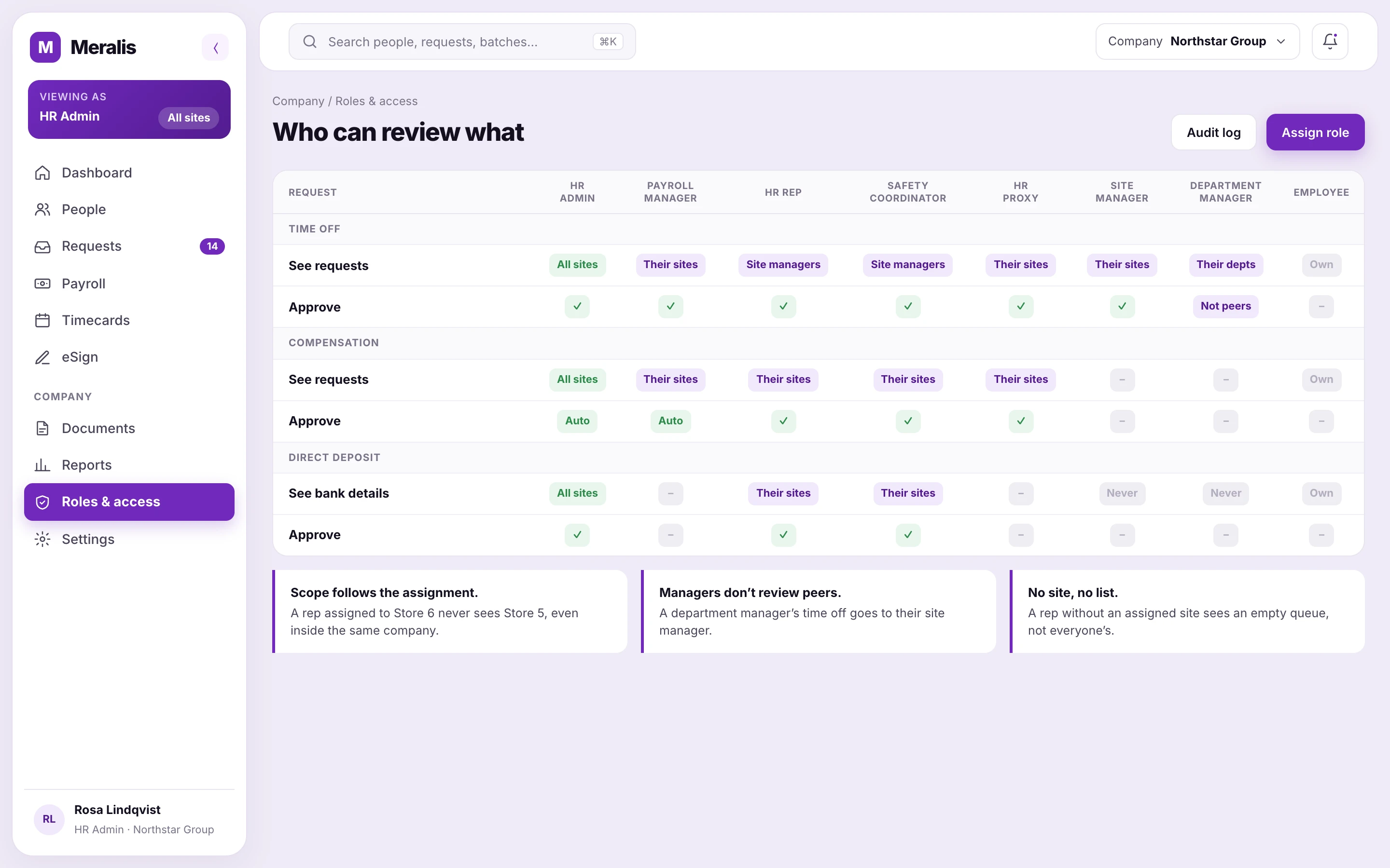
I mapped nine roles, from HR Admin and Payroll Manager to HR Rep, Safety Coordinator, HR Proxy, Site Manager and Department Manager, against what each one can see and approve for every request type.
Two rules shaped the product: a department manager never reviews a peer manager, and nobody but HR ever sees bank details. Scope is derived from the person’s assignments, so a dashboard widget and the full queue always show the same thing.
03 / Decisions that shaped the experience
Designing what happens
when the stakes are higher.
Four workflows show how product rules became visible, usable interactions.
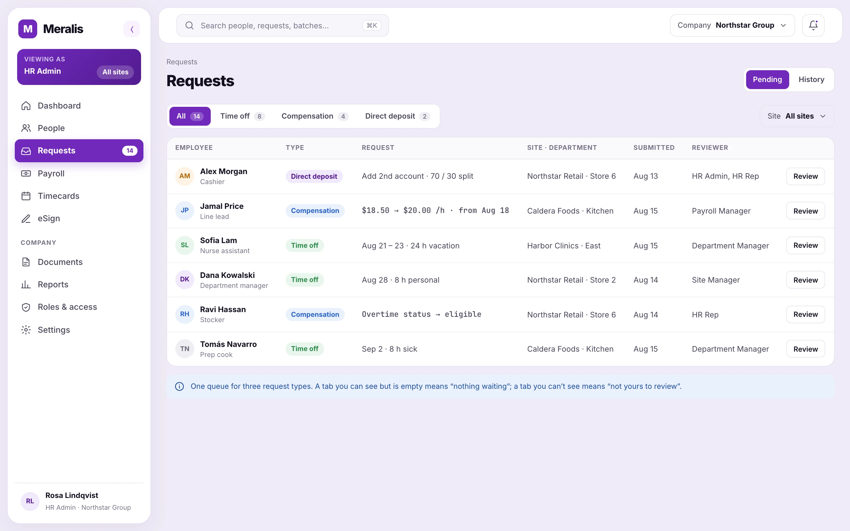
Bringing three approval queues together.
Time off, compensation and direct deposit each had their own approval screen. Reviewers checked three places, and managers saw empty lists where they had work to do.
- The decision
- One hub with a tab per request type, sorted oldest first, showing who the reviewer is on every row.
- The guardrail
- A visible but empty tab means “nothing waiting”. A missing tab means “not yours to review”, so nobody sees work they can’t act on.
- Why it matters
- Scope is calculated from the person’s assignments, so the dashboard card and the hub always agree.
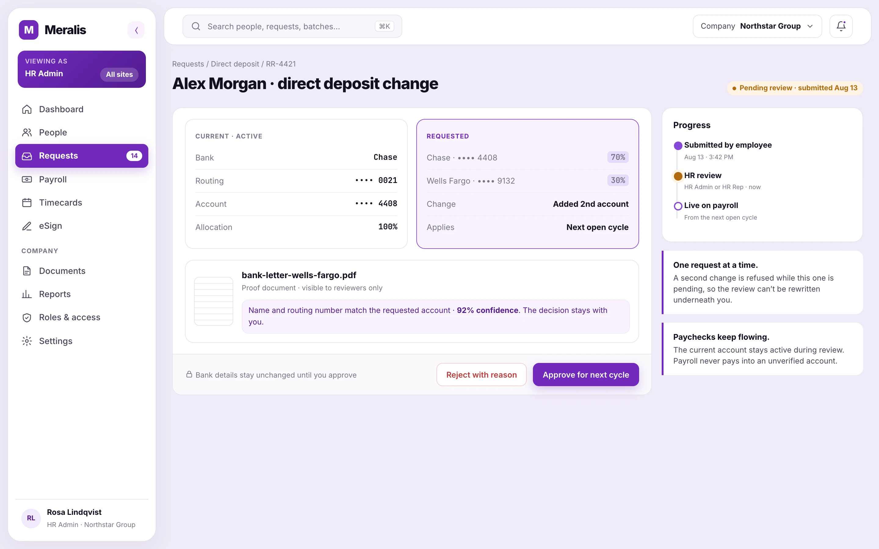
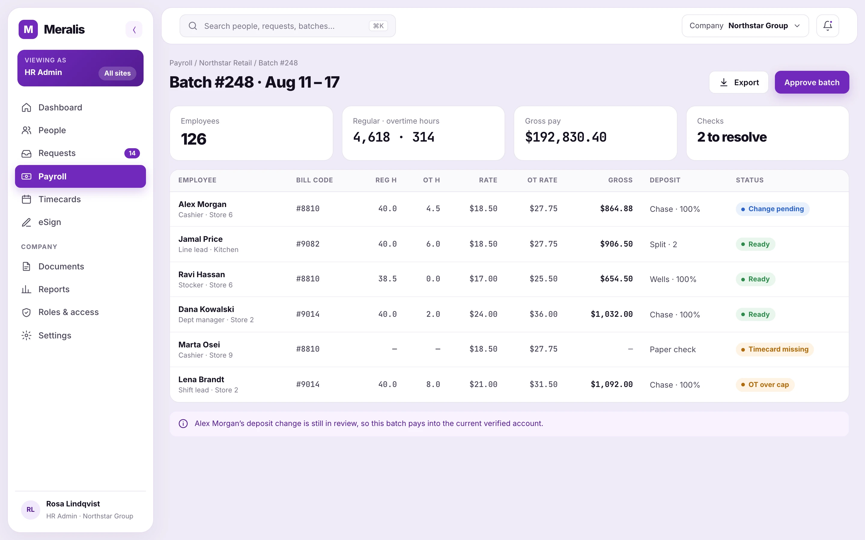
Keep payroll moving while a change is reviewed.
A bank change needs a decision surface that explains what is active, what is being requested and what the reviewer needs to check.
- The decision
- Place current and requested account details side by side. Keep the verified method active during review.
- The guardrail
- Apply approved changes to future open cycles. Require a reason for rejection so the worker can correct the request.
- The trade-off
- OCR and match confidence help the reviewer inspect evidence. The final approval remains a human decision.
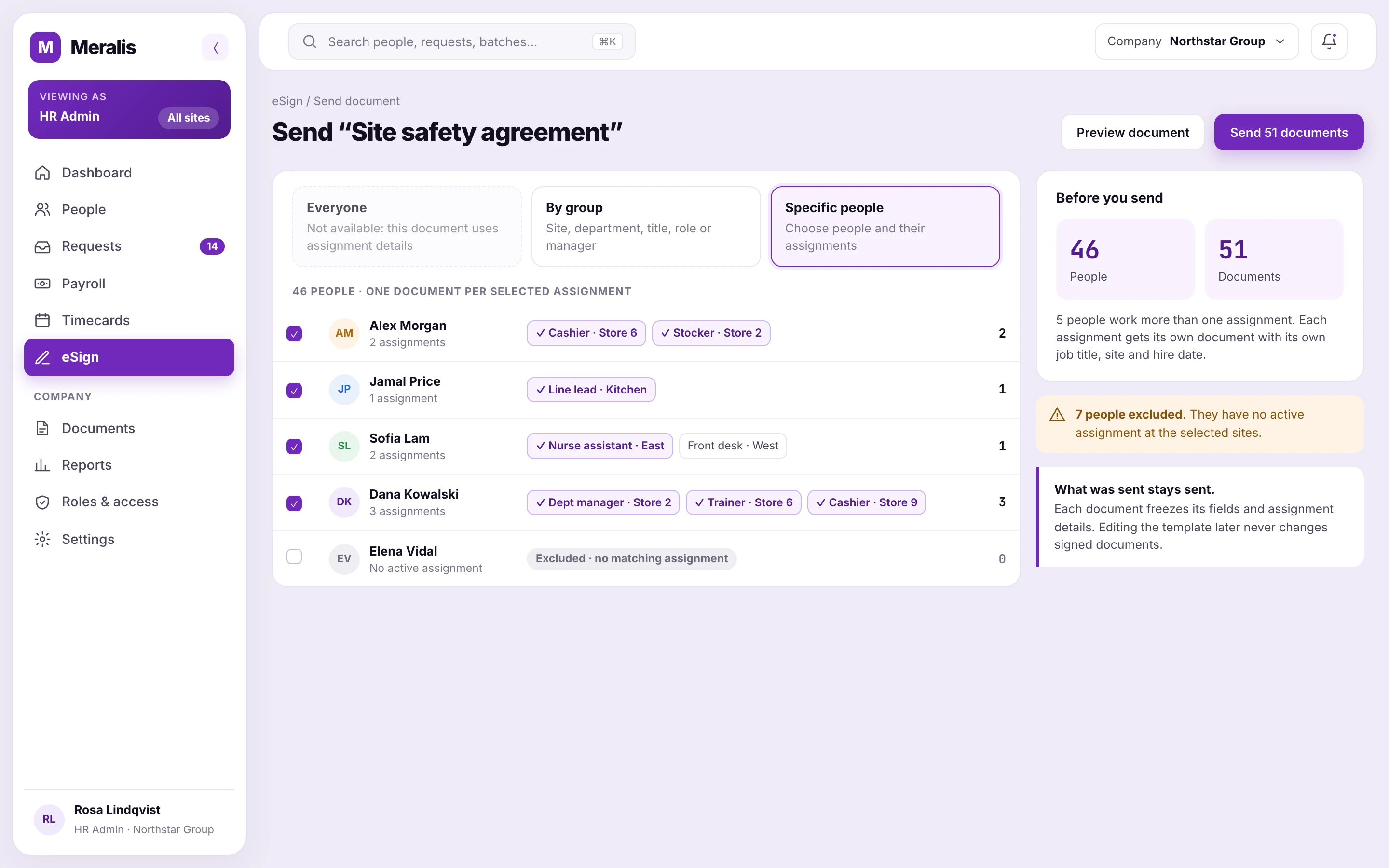
Send the right document for the right assignment.
One employee can work across several sites. A signature tied only to their identity loses the work context that gives the document its meaning.
- The decision
- Separate employee-level templates from assignment-aware ones. Block “Everyone” when a template needs a specific assignment.
- The guardrail
- Show employees and generated requests as separate counts, and explain exclusions before sending.
- Why it matters
- In this example, 46 employees produce 51 requests. The interface explains the difference instead of treating it as an error.
04 / From design intent to delivery
Shared foundations for the product and the team building it.
As the platform grew, repeated interface decisions needed a shared foundation. I documented tokens, components, states and layout behavior so the next feature could build on an existing pattern.
The visual system separates brand identity from action and status. Purple provides continuity; hierarchy, spacing and semantic states help users read dense operational screens.
Clear hierarchy. Dense data.
Behavior belongs in the handoff.
Loading, empty, disabled and permission states are part of the component contract.
Layout needs acceptance criteria.
Equal-height columns and internal scrolling are specified alongside the visual design.
Shared foundations support change.
About 150 tokens, 42 components and 51 documented flows give the team a shared base for implementation.
05 / What changed
From stalled to launched.
The product brings requests, documents and pay that were handled in separate places into one operating model. My contribution spans the relationships behind the product, the decisions within each flow and the shared interface foundations.
When I joined in 2024, this product had been in development for years without launching, and so had its sister product. I organized the work around flows, stakeholder validation and a shared design system, and both products shipped to production. Around 200–300 people use them today, and I designed the training they went through.
Every feature goes through the same path: meetings with stakeholders to validate what people will actually use, a flow before any screen, and a documented handoff. A feature now goes from design to release within a single two-week sprint, because developers start from shared components instead of new ones. PMs often mention the documentation as what makes onboarding new team members easy.
What I would do earlier: establish a shared product model and decision log at the start. In a product that keeps growing for years, rules that only live in people’s heads cause as many problems as inconsistent screens.