Product design · Workflow rules · Design system · Onboarding
How a staffing order moves
between companies, MSPs and agencies.
Relay connects companies that need workers with the MSPs and agency branches that find them. I design how a staffing order moves through that chain: who owns it, how urgency shows, how it ends, and what each side is allowed to see.
Explore the design decisions ↓A staffing order passes through companies, MSPs and agency branches, and nobody was sure who owned it or how it ended.
Product Designer for the whole product: order rules, interface, design system, prototypes and user training.
Launched after about five years in development; used by around 200–300 people who learned it through the training site I built.
Workflow rules, interface, design system, prototypes, QA audits and user training, across every role.
Client companies, MSPs, agency branches, workers and platform admins in one product.
From the service order to fulfillment, assignments and timekeeping.
Relay is an anonymized identity for a live product at my current company. Screens are portfolio reconstructions of my shipped and proposed designs, with illustrative data. Shared HR modules such as time off and payroll are covered in the Meralis case; this case focuses on what is unique to the marketplace.
01 / The problem behind the brief
One order goes through a lot of people.
A company asks for fourteen pickers on Monday. The MSP splits that service order into job orders, invites agency branches, collects pledges and chases candidates through compliance, while the company waits to review them.
Every handoff created a question: who owns this order now, is it at risk, did it fail or was it cancelled, and which details should the client never see?
My work was to answer those questions with clear rules and show them on screen.
Client company · places a service order
MSP · distributes job orders
Agency branches · pledge and fill
Workers · assigned and clocked in
Ownership · Urgency ·
Outcome · Visibility
Four rules every screen follows
Each decision below is one of these rules made visible.02 / Decisions that shaped the experience
Decisions about the order,
from request to fill.
Four decisions on the order, from the recruiter’s grid to the client’s view.
Showing urgency without a wall of red cards.
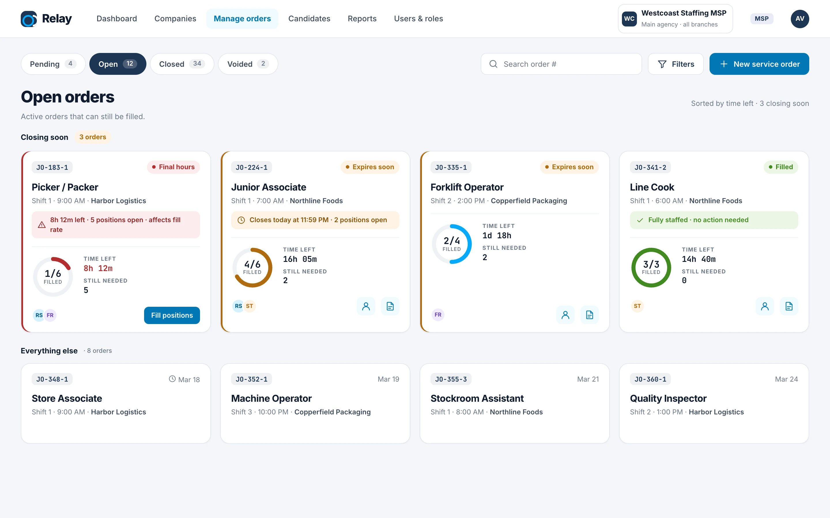
Orders auto-close at their start date. Recruiters needed to see risk early, but a grid full of red cards stops meaning anything.
- The decision
- Three calm steps: an amber status under 48 hours, an inline note under 24, and red only in the final 12, with the next action on the card.
- The guardrail
- Only unfilled orders escalate. A fully staffed order stays calm, and there are no red backgrounds, pulsing or countdown seconds.
- Why it matters
- Orders closing soon are grouped and sorted first, so the most urgent work is always at the top.
Replacing “Deleted” with real outcomes.
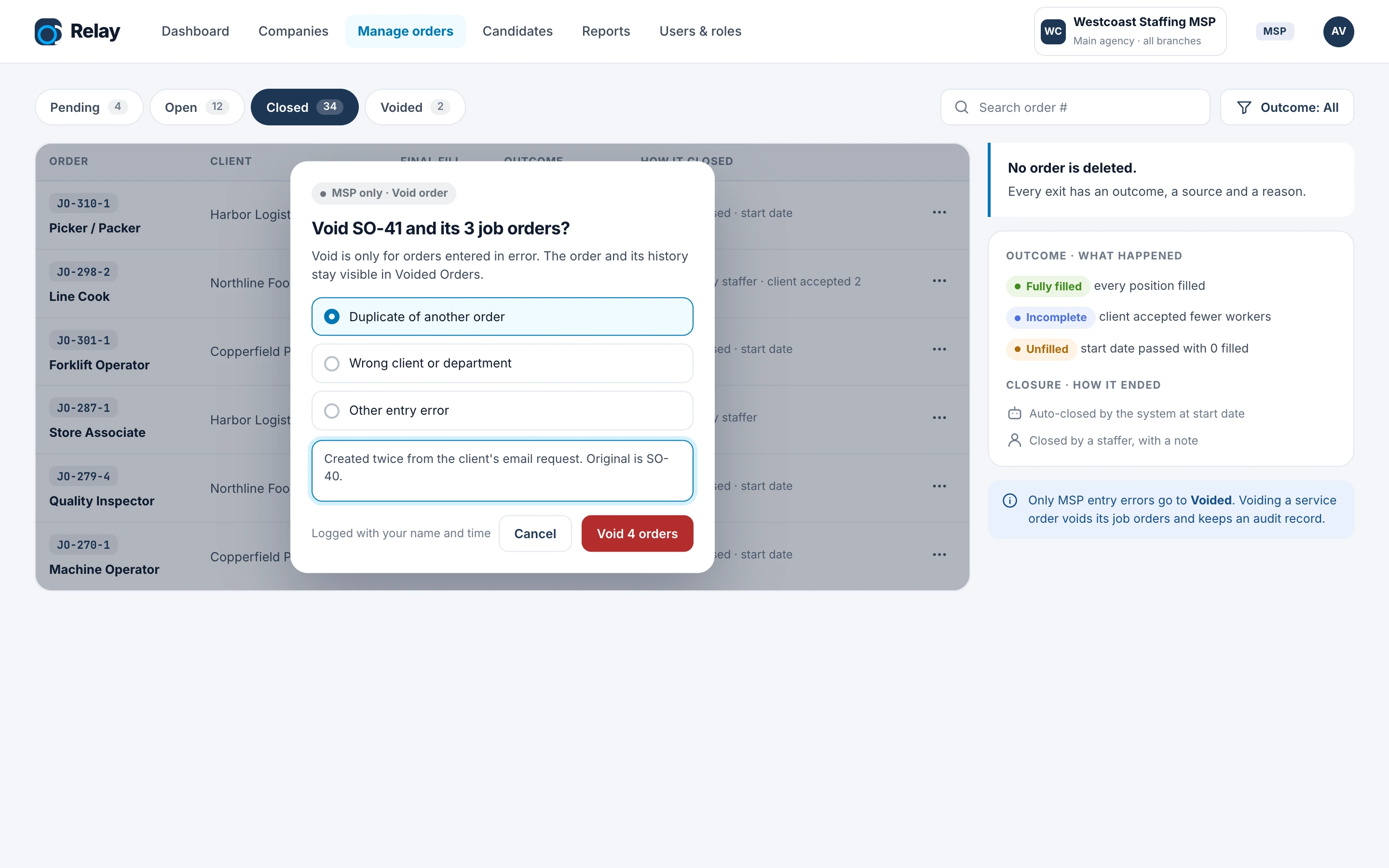
The old “Deleted” tab mixed failed orders, cancelled orders and mistakes, and implied the history was gone.
- The decision
- Tabs become Pending, Open, Closed and Voided. A closed order shows what happened (fully filled, incomplete, unfilled) separately from how it closed (automatically or by a staffer).
- The guardrail
- No order is deleted. Void is only for MSP entry errors, needs a reason, and voiding a service order voids its job orders with an audit record.
- Why it matters
- Reports can now tell a hard-to-fill order apart from a data-entry mistake.
Making it clear who owns each order.
Several MSP users and branches work the same order. Without clear ownership, nobody felt responsible for the gap.
- The decision
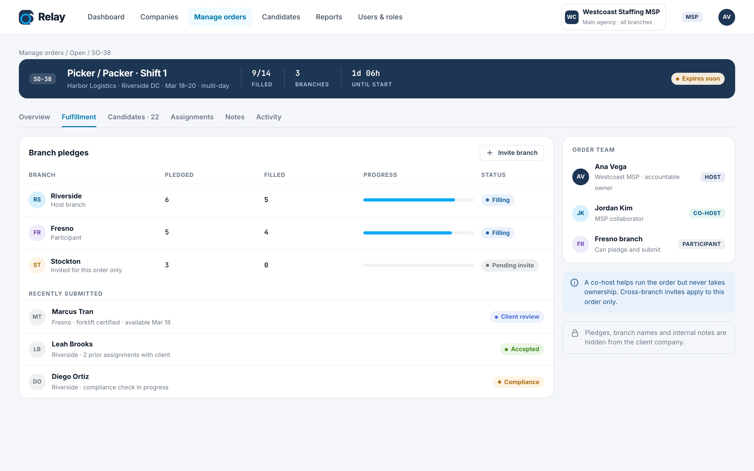
- Every order has a host who owns it, co-hosts who help without taking ownership, and participants who can pledge and submit.
- The guardrail
- Cross-branch invites apply to one order only and stay pending until accepted. A sticky summary keeps fill, branches and time left in view while you switch sections.
- Why it matters
- Pledges make capacity explicit before filling starts, so fill rate is measured against a commitment.
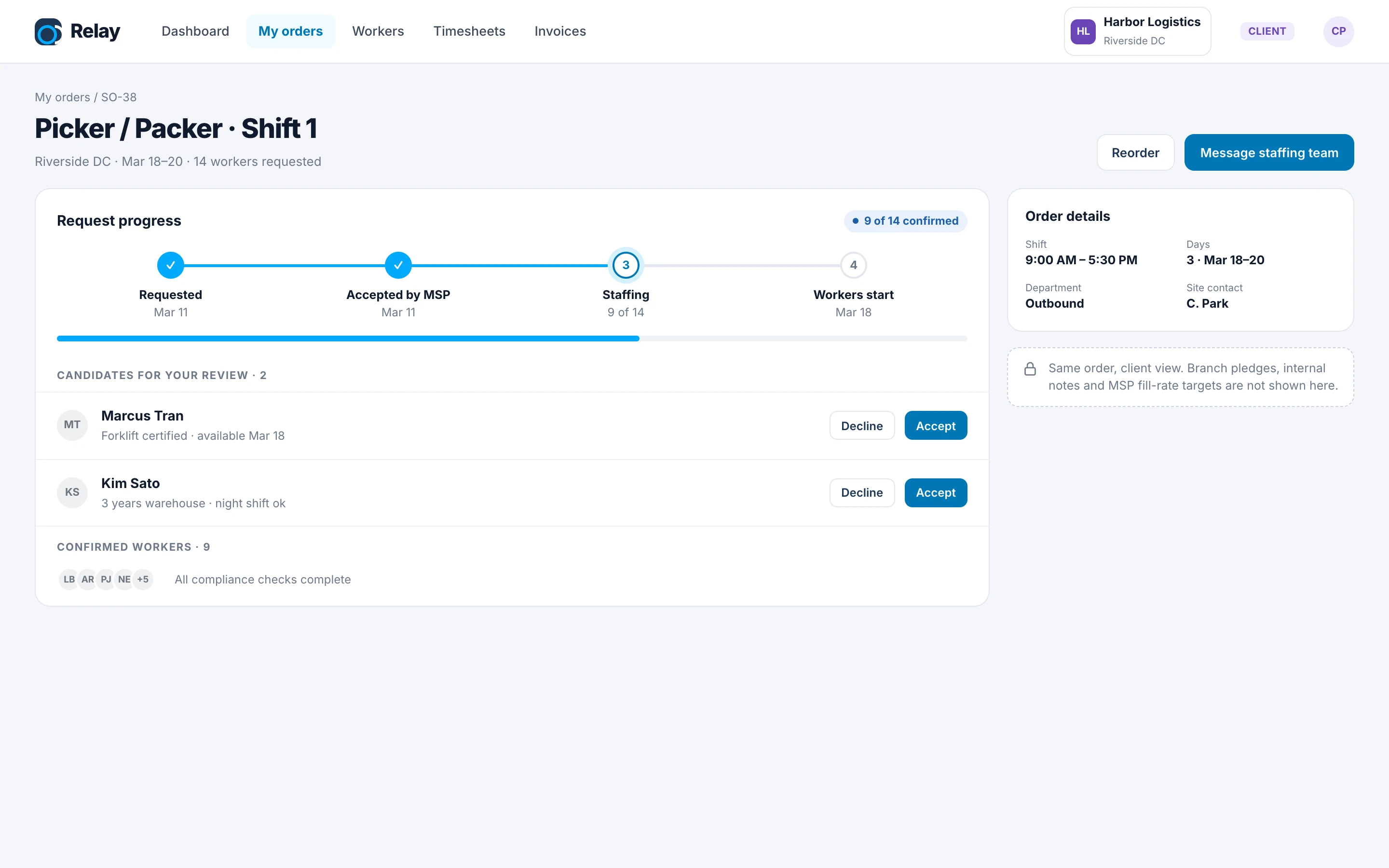
What the client sees, and what stays internal.
The client company and the MSP look at the same order, but the client should never see branch pledges, internal notes or fill-rate targets.
- The decision
- The client view is built around progress and the decisions only they can make: accepting or declining candidates.
- The guardrail
- Internal data is removed for the client role in the data itself, and the screen tells MSP users what the client can’t see.
- Why it matters
- Clients see their progress without seeing how the MSP works with its agencies.
03 / The system underneath
Built on a design system shared with Meralis.
Relay runs on Foundry, the token-based system I maintain for both products. Here it fixed a brand color that failed contrast (2.6:1 → 4.86:1) and gave status and role badges different colors so they don’t get confused.
05 / Where it landed
Shipped after five years in development.
Relay had been in development for about five years when I joined in 2024. Clear order rules, flows validated with stakeholders before each feature and a shared design system helped the team get it to production. Around 200–300 people use it today, together with Meralis, and the training site below is what they learned with.
Every feature I design ships with a documented handoff, and most features now go from design to release within one two-week sprint. The user training site came out of the same habit: writing things down so new people can learn on their own.
04 / User training
Training new users on the whole workflow.
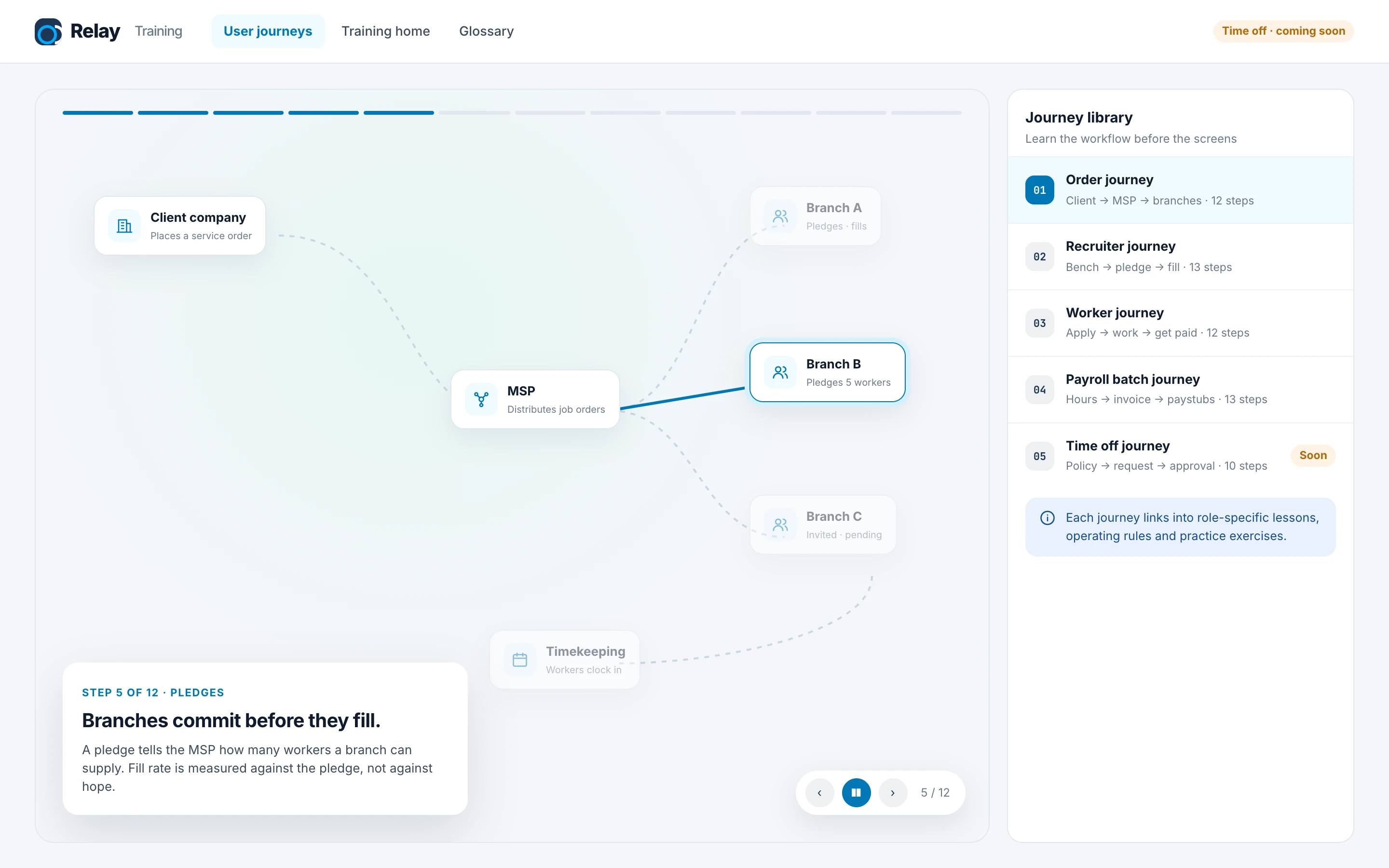
New users struggled because they learned screens without understanding the chain behind them. I designed and built a training site: five animated journeys (order, recruiter, worker, payroll and time off) that show how work moves between teams, linked to role-based lessons and exercises.
What I would do earlier: write the order rules (ownership, outcomes, who sees what) in a shared document before designing any screen. A lot of my later work was turning rules people had in their heads into something written.