Design systems · Accessibility · Design ops · AI-assisted workflow
A design system
shared by two products.
Foundry is the design system behind Meralis and Relay. I created it so both products could use the same tokens, components and rules. Everything is written down, so developers and the AI tools we use read the same guidelines I do.
See the system ↓Two related products were built with different components, hardcoded colors and a brand color that failed contrast.
Creator and owner of the system, built hand in hand with one front-end developer.
42 components and 177 shared tokens used by around eight developers; features ship within one two-week sprint.
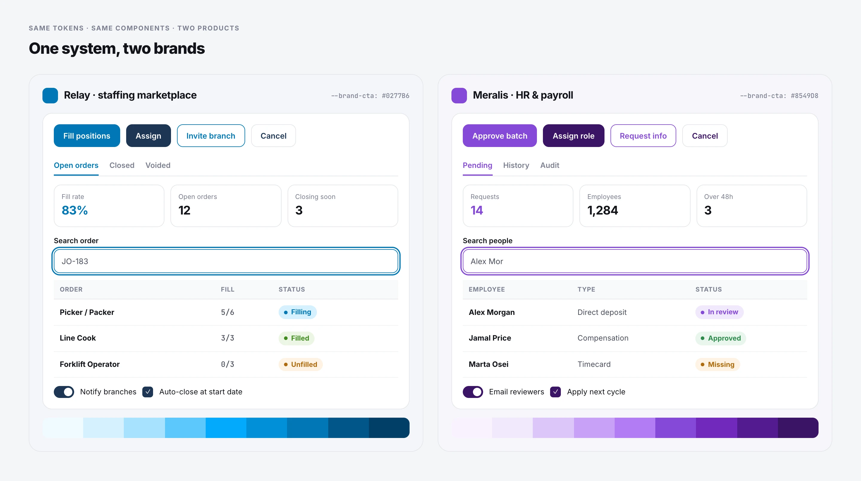
I created the system: token values, guidelines, component rulings and documentation. One front-end developer implemented it hand in hand with me.
42 documented components and 193 semantic tokens, 177 of them shared, used daily by around eight developers. 16 logged decisions.
Specs that both developers and AI coding tools follow. Figma stays as the visual reference.
Foundry is a portfolio name for the design system of two live products at my current company. The boards use the real token values and rules.
01 / The problem
Two related products, built in two different ways.
The HR product and the staffing marketplace share modules like time off, payroll and roles, but they were built with different component libraries, hardcoded colors and their own spacing.
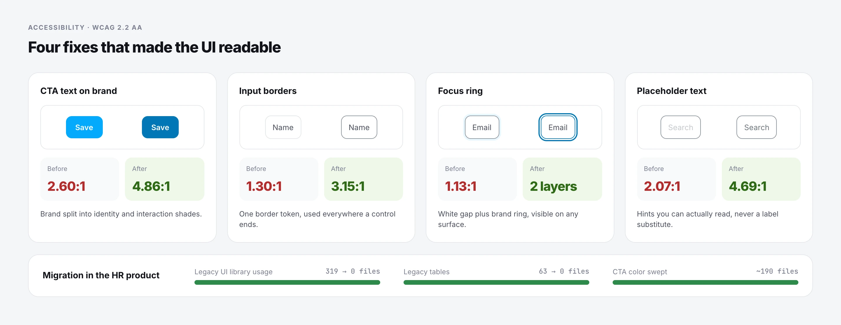
The marketplace’s bright brand color was used for buttons and text, where white text reached only 2.6:1. Borders and focus rings were almost invisible.
I wanted one system both products could use, while each one kept its own brand.
02 / Principles
Principles before pixels.
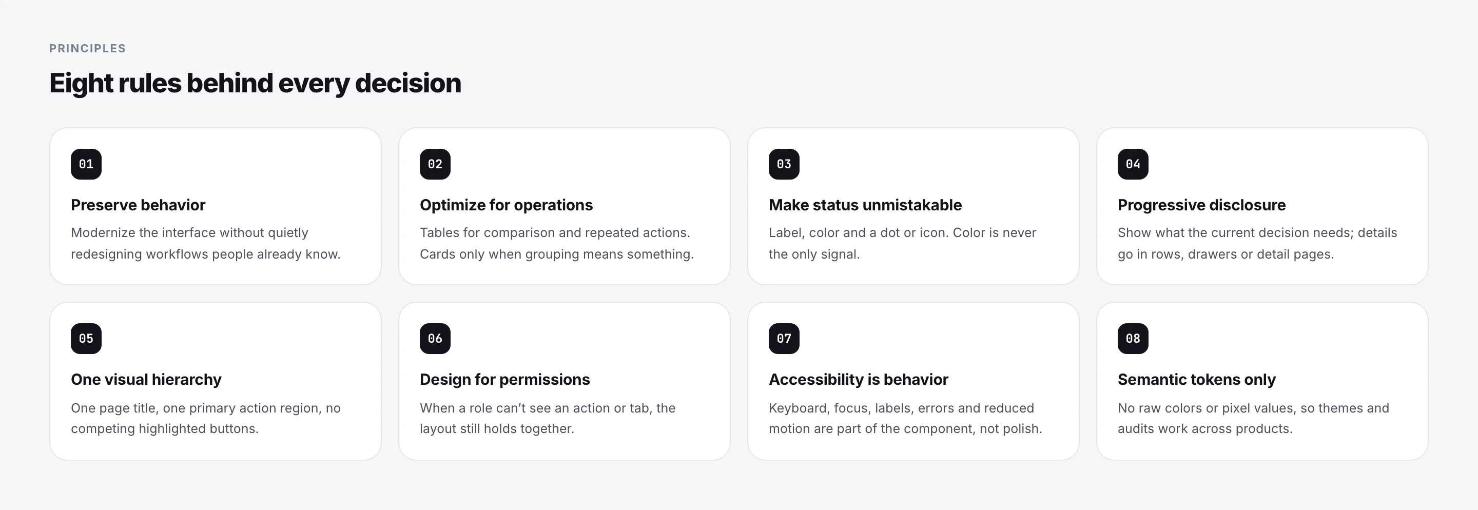
Before touching components, I wrote down what the system should protect. The products were already in use, so the first rule was to modernize the interface without changing workflows people knew. The rest came from what kept going wrong in reviews: too many highlighted buttons on one screen, status shown only with color, and layouts that broke when a role couldn’t see an action.
03 / One system, two brands
The same tokens, with a different brand on top.
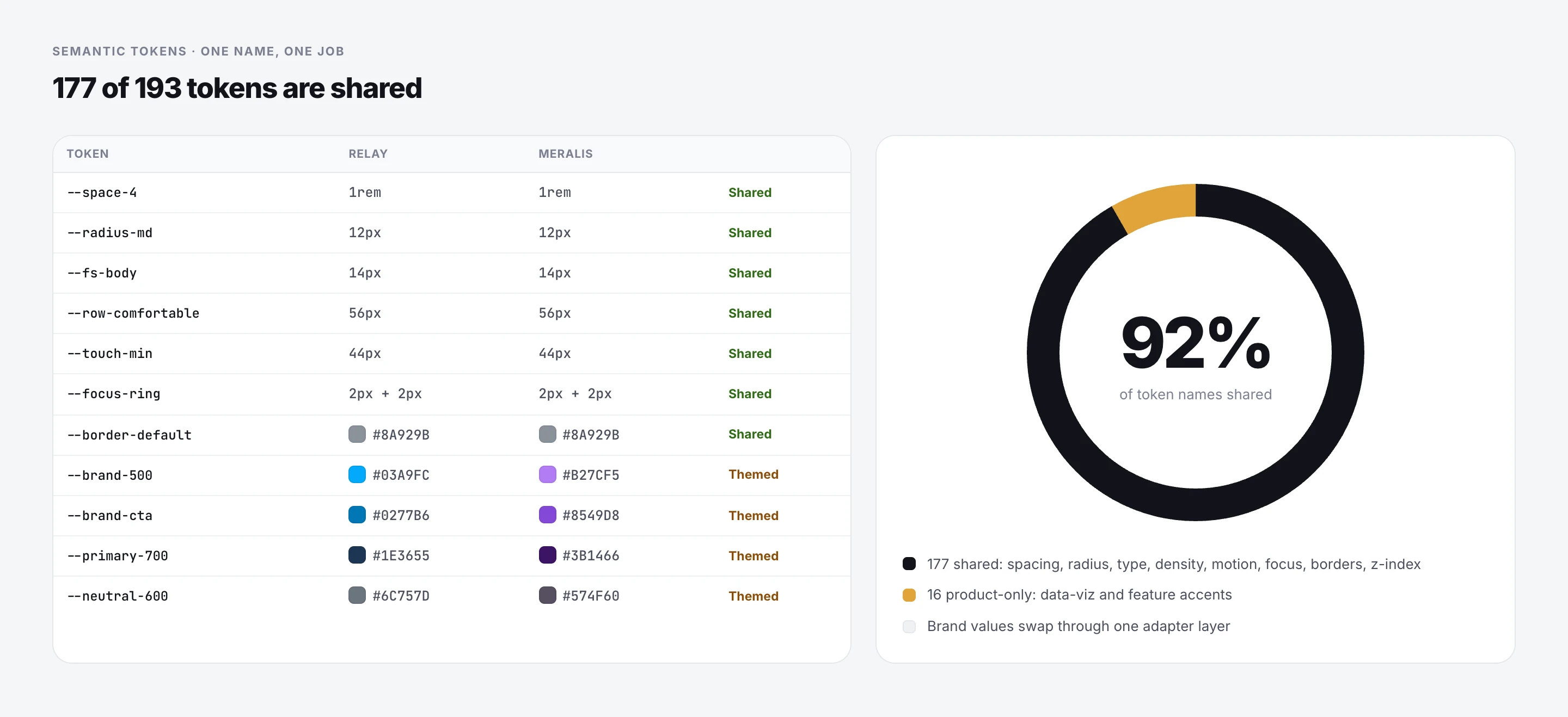
Both products use the same semantic tokens and components. A thin adapter layer maps each product’s brand palette onto those names, so a button is always --brand-cta, whether it renders cyan or purple.
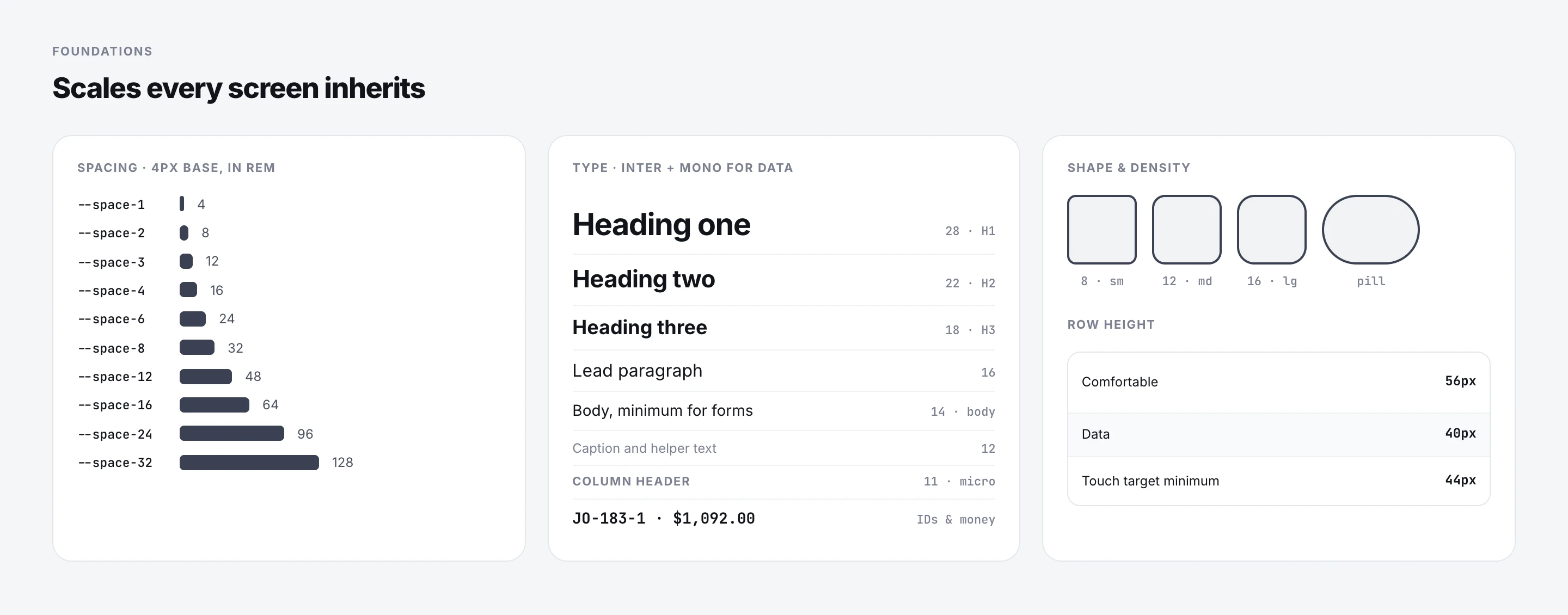
Spacing, radius, type, density, motion, focus and borders are shared outright. Only brand, neutrals and a few data-visualization accents are themed.
04 / Components
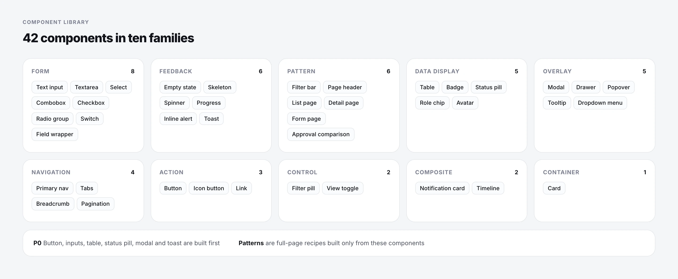
42 components, built in priority order.
I grouped the library into ten families and marked the ones every screen depends on as P0: buttons, inputs, the table, status pills, modals and toasts. Those were built and tested first, so product work could move to the new system early instead of waiting for the full set.
Patterns sit on top: list, detail, form and approval pages are recipes made only from these components, which is what keeps new features consistent without new design work.
05 / Patterns
A rule for every container.
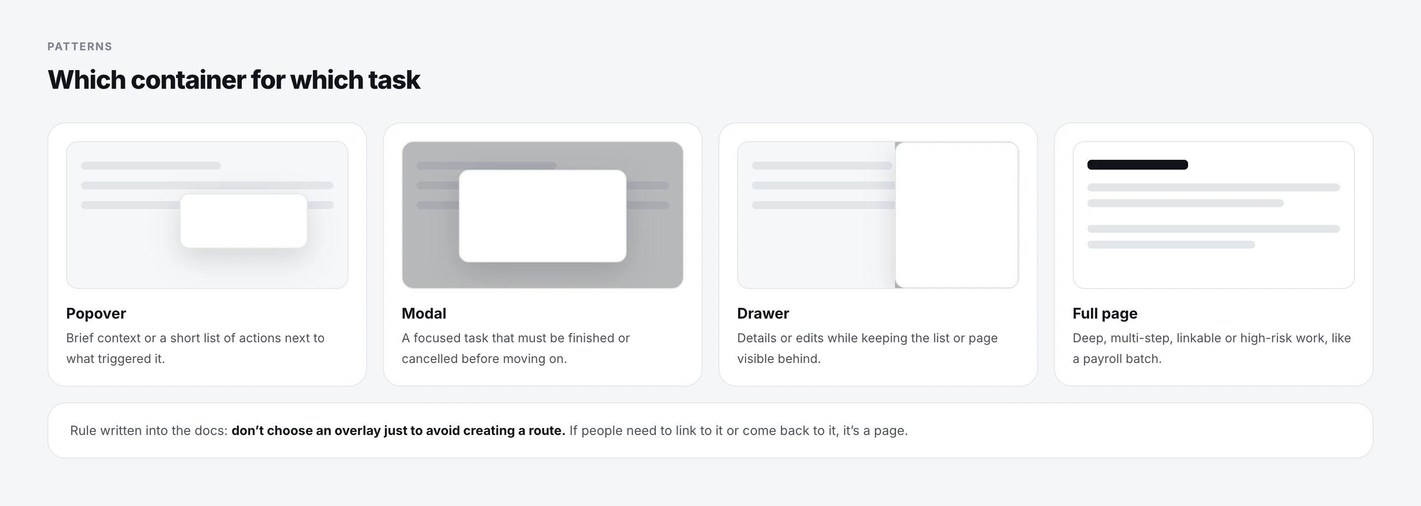
One recurring debate was whether something should open in a modal, a drawer or a new page. I turned it into a rule: popovers for brief context, modals for focused blocking tasks, drawers to keep the page in view, and full pages for anything deep, multi-step or linkable.
06 / Accessibility
Fixing contrast in the tokens instead of screen by screen.
I audited contrast against WCAG 2.2 AA and fixed the system at the token level, so every screen improved at once instead of page by page.
The biggest change was splitting the brand color in two: a bright identity shade for logos and decoration, and a darker interaction shade for anything that carries text.
07 / Rules
Rules written down, with examples.
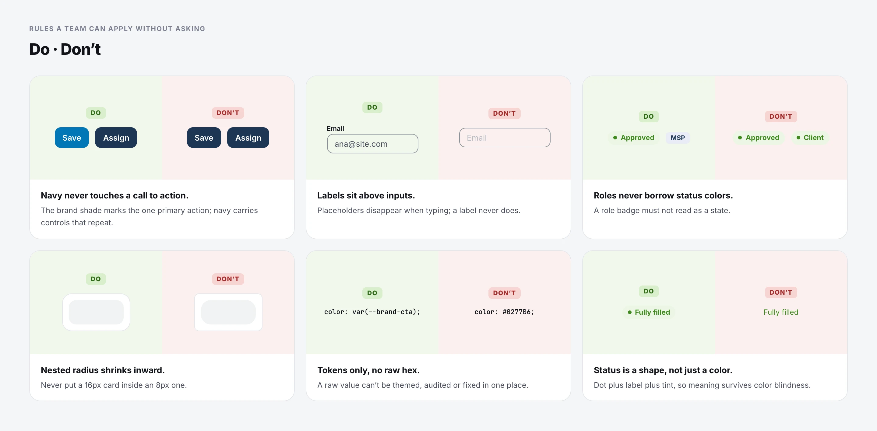
Most of the questions I got from developers were the same few questions, asked again and again. So I wrote each rule with the reason behind it and a do and don’t example, in the same documents developers and AI tools read.
08 / Maintaining it
How we keep it up to date.
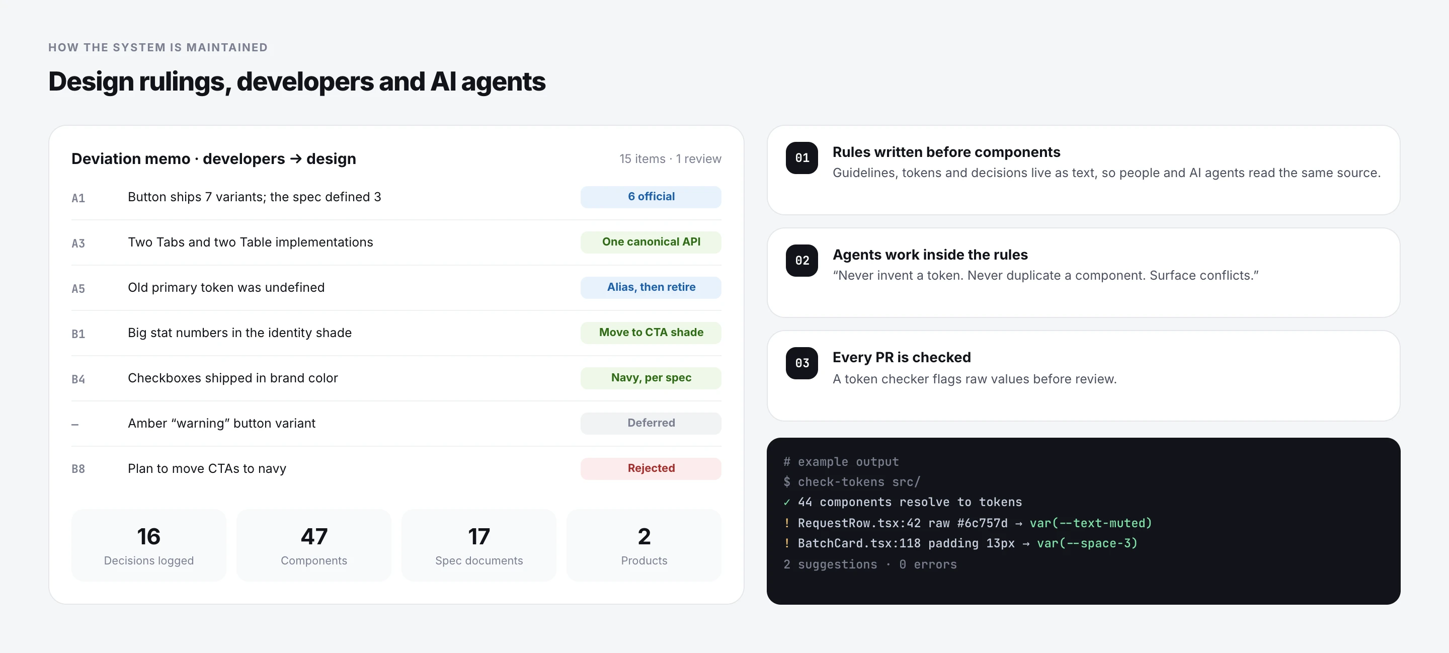
I built the system hand in hand with one front-end developer. After each implementation wave, the developer sent a deviation memo: where the code differed from the spec, and what they needed decided. I reviewed every item, made a decision and wrote it down. Sometimes the answer was no: there was a plan to move all buttons to navy, and I rejected it because it broke the contrast rules.
The same specs work as instructions for AI coding tools: don’t create new tokens, don’t duplicate components, and flag conflicts instead of guessing. A small script also checks for hardcoded values before code review.
09 / Governance
How decisions are made and kept.
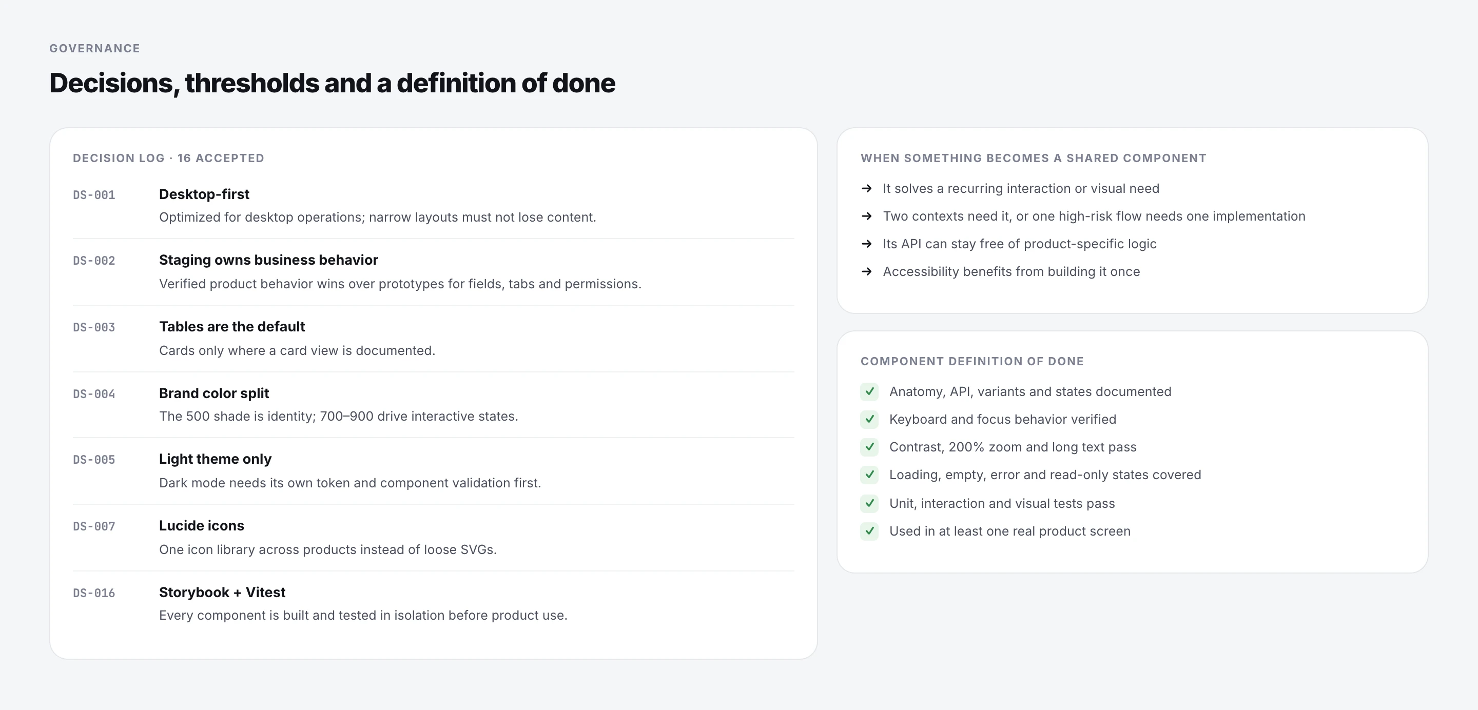
Every system-level choice goes into a decision log with an ID, so nobody has to remember why tables are the default or why there is no dark mode yet. Sixteen decisions are accepted, and open questions are listed separately until someone from product or engineering confirms them.
Two short checklists do most of the governance work: when something deserves to become a shared component, and what “done” means for a component before it can ship.
10 / Where it started
Where it started.
The first version grew out of an e-commerce template and a set of static component specs. Design System 1.0 documents that starting point: foundations, components and states for a single product.
Foundry is the second version. The main differences are semantic tokens instead of raw colors, contrast fixed in the values themselves, and one shared base for two products.
11 / What’s next
What changed, and what’s still left.
Since the system was centralized, a feature usually goes from design to release within one two-week sprint: developers start from the same components and tokens instead of recreating them, and the around eight developers who use it day to day have told me it is easier to work with. Both products it supports are now live.
Component adoption is well ahead of token adoption: the HR product still carries thousands of raw color values from before the system. The next steps are a single shared package for both products, a synced Figma library, and turning the dark-mode and tenant-theme hooks that already exist into shipped features.
What I would do earlier: start the decision log on day one. A lot of questions from developers were about decisions we had only talked about in a call.